MOLU DESIGNS
MOLU DESIGNS

NEWS

Posts tagged signpainting
YOU HAD ME AT MEATBALLS

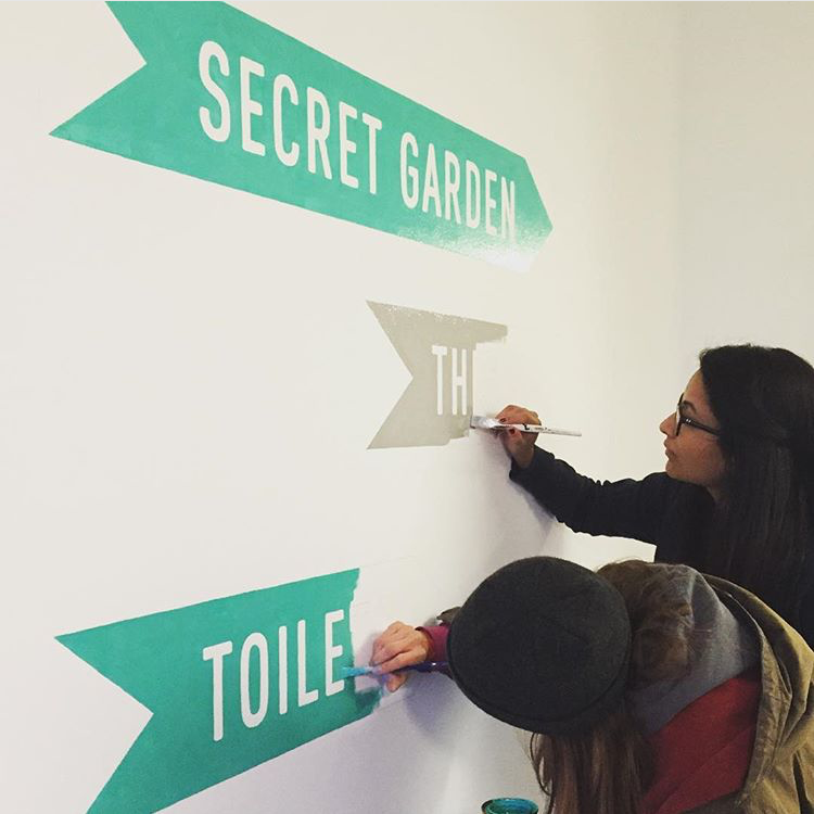
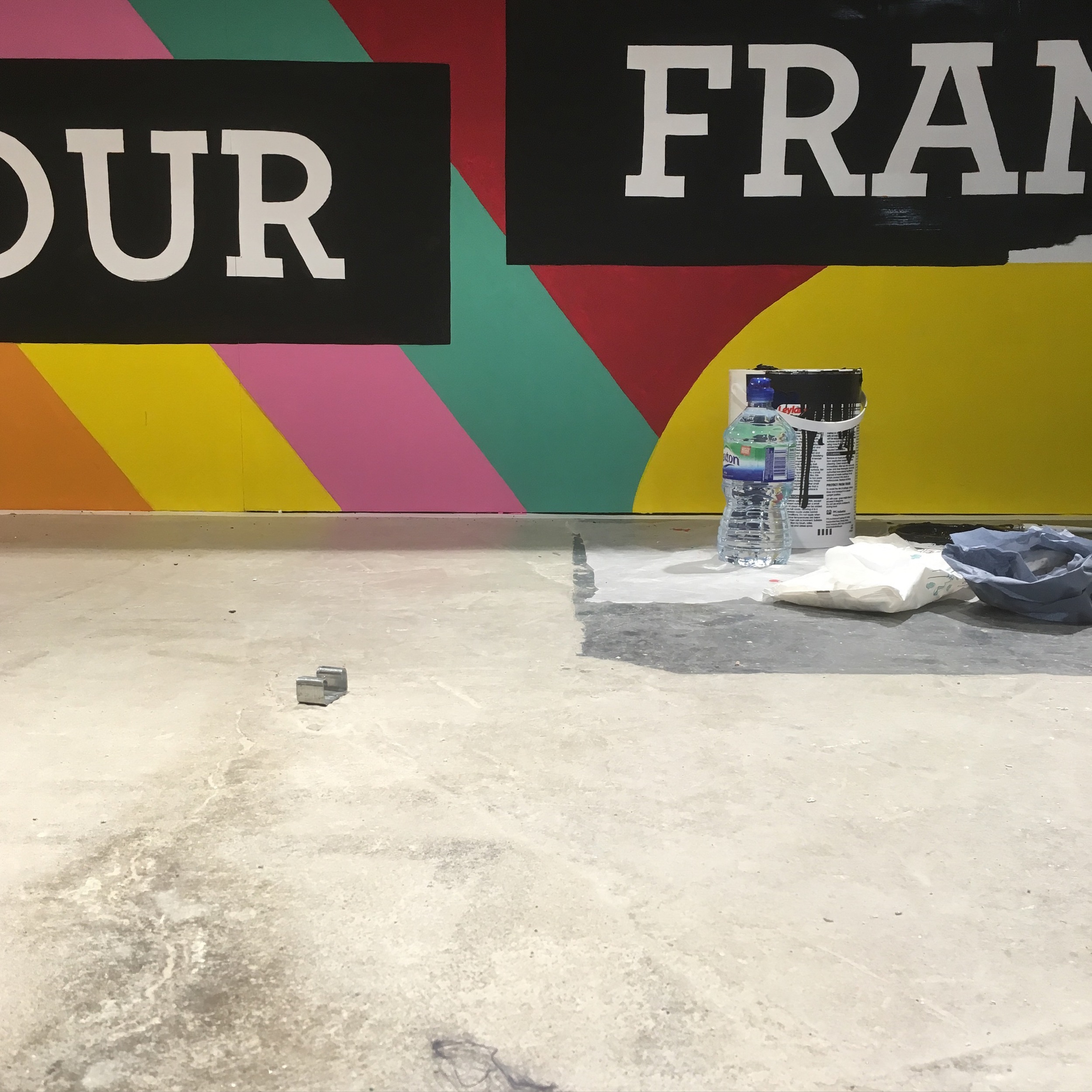
Another favourite from earlier this year (and yes, another yellow one!!)  a shopfront project I worked on this Spring for a hip, new, pop-up meatball joint called CURVEBALL opening up in Balham. I was commissioned to paint their logo as well as design and paint playful window graphics that would grab people's attention and lure them in, particularly in the the run up to their big launch.  

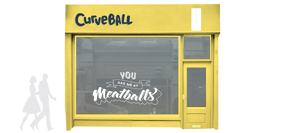
The premises is located on a busy pedestrianised street just off Balham high street, surrounded by numerous shops and well known eateries so it was imperative that the new spot "stood out from the crowd", so to speak. 

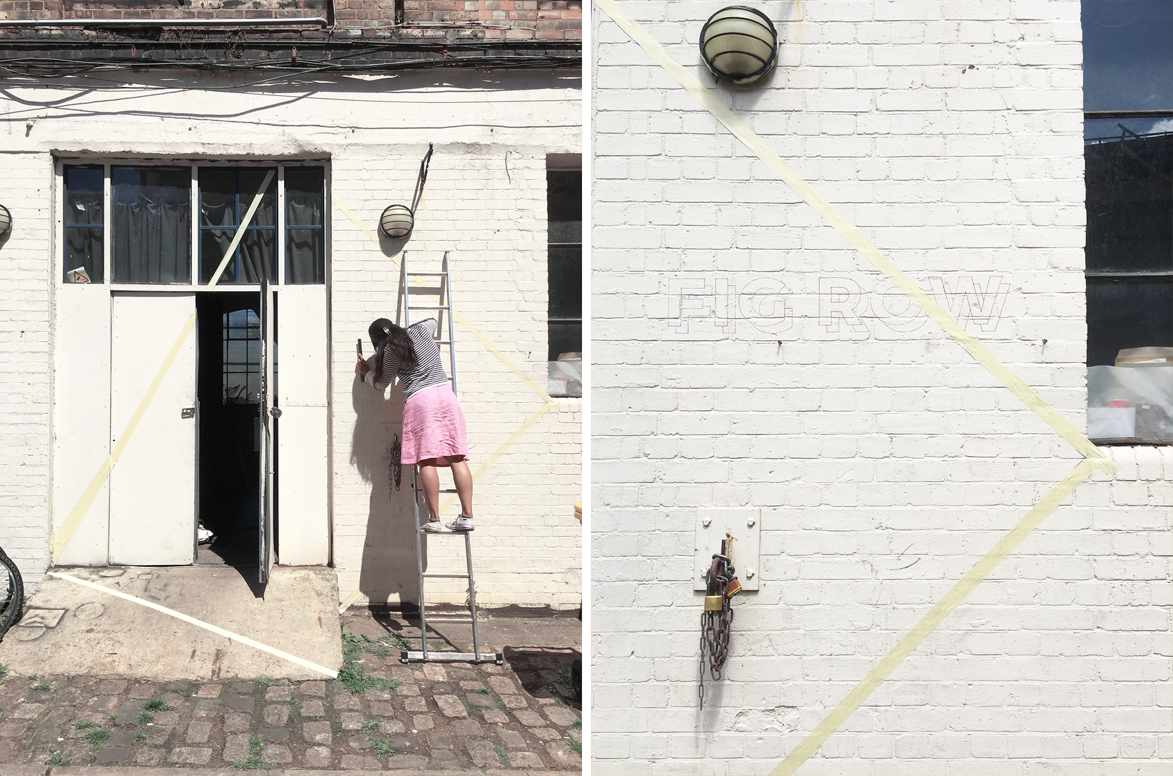
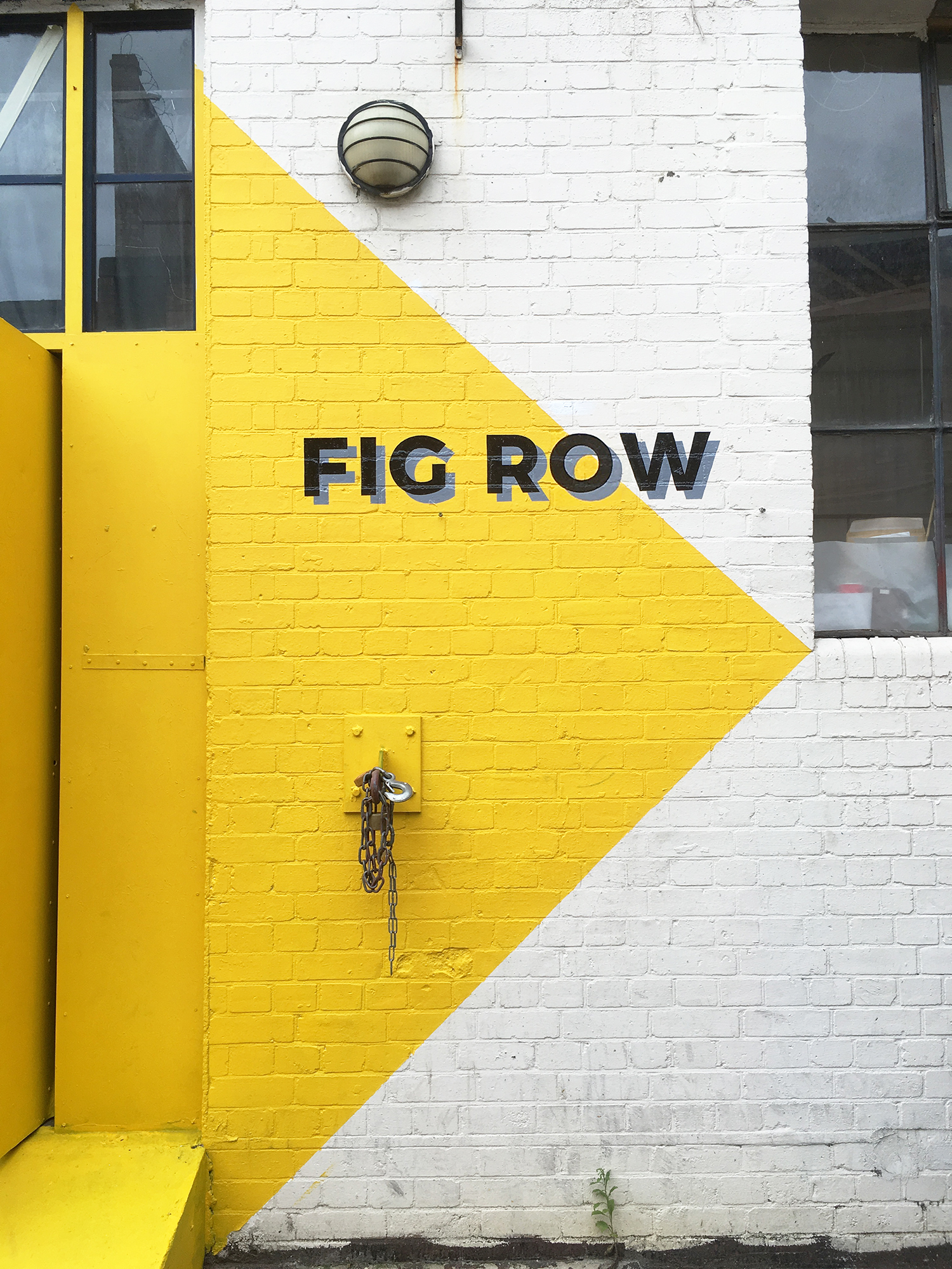
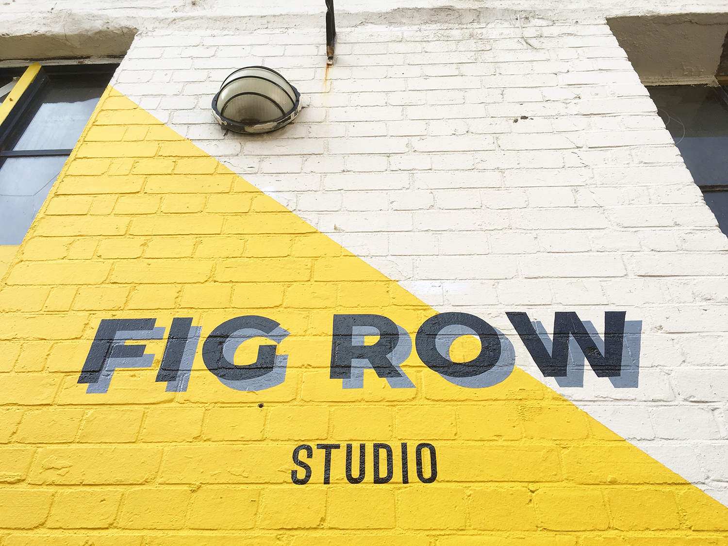
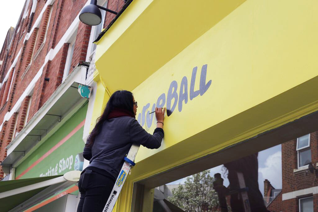
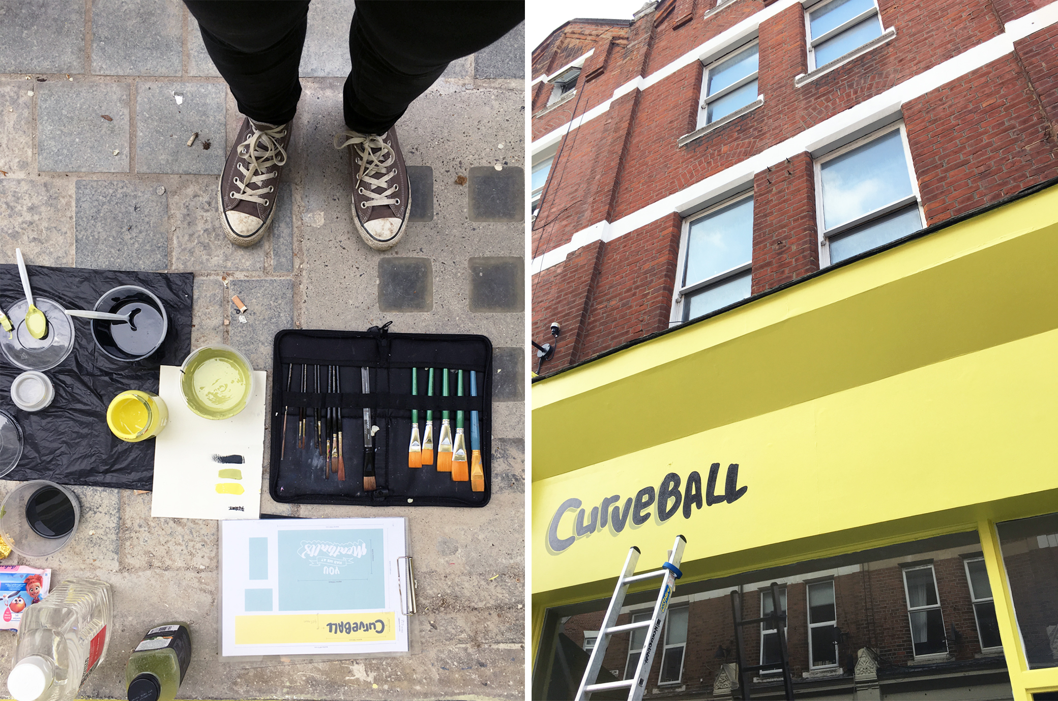
So after a series of discussions on the overall aesthetics of the restaurant, it was decided that the first move to achieve a frontage that popped out from all the distractions on that street, and stay in keeping to the brand, was to paint it a fresh, zingy colour a.k.a. 'Yellowcake' by F&B. The logo I then painted was done in a dark charcoal grey/black colour, with a subtle drop shadow, in order to maximise legibility from all points on that busy street.  

Simple yet effective.

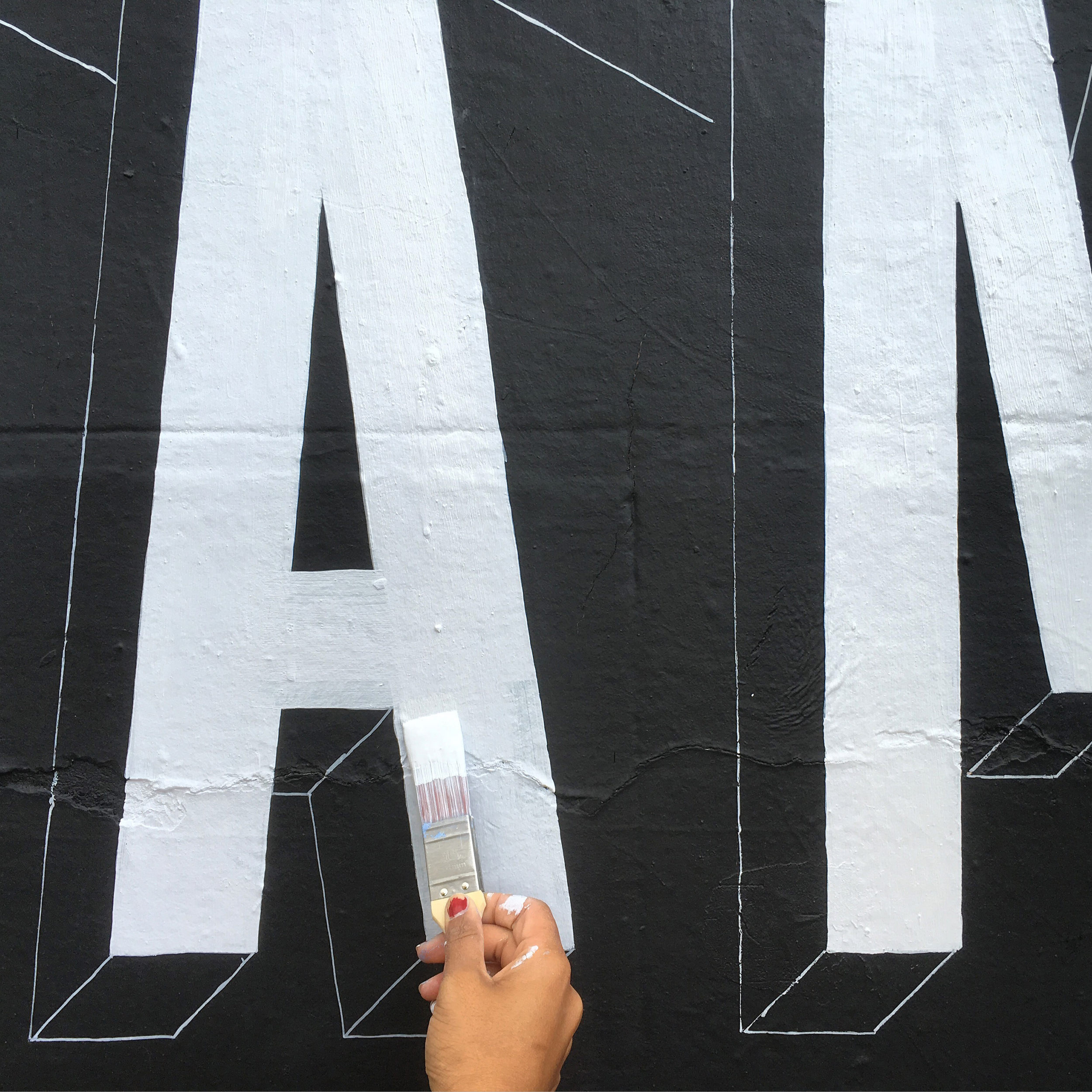
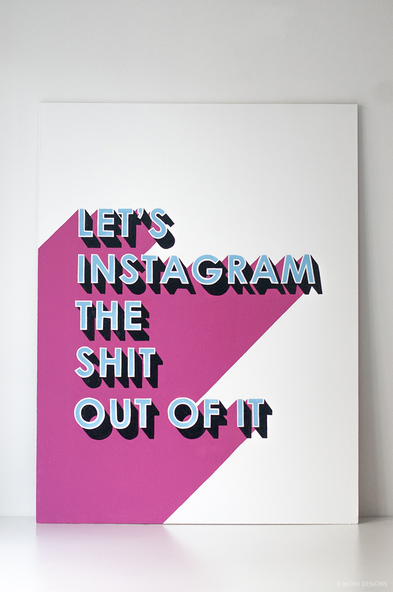
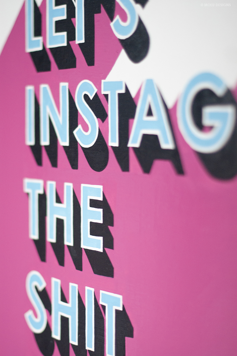
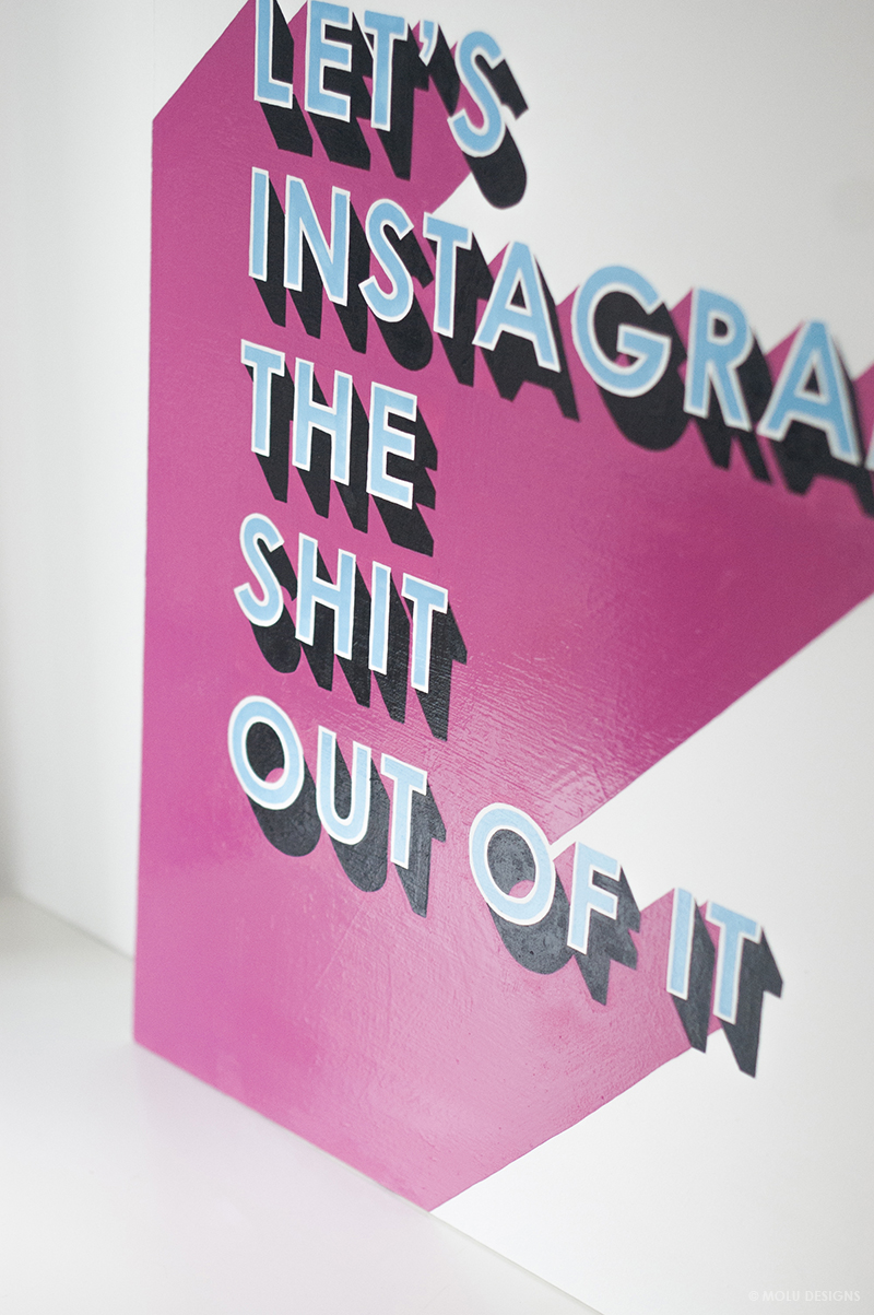
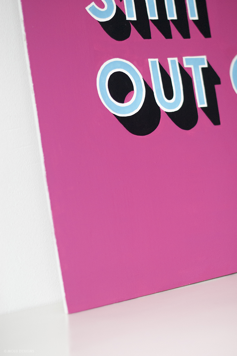
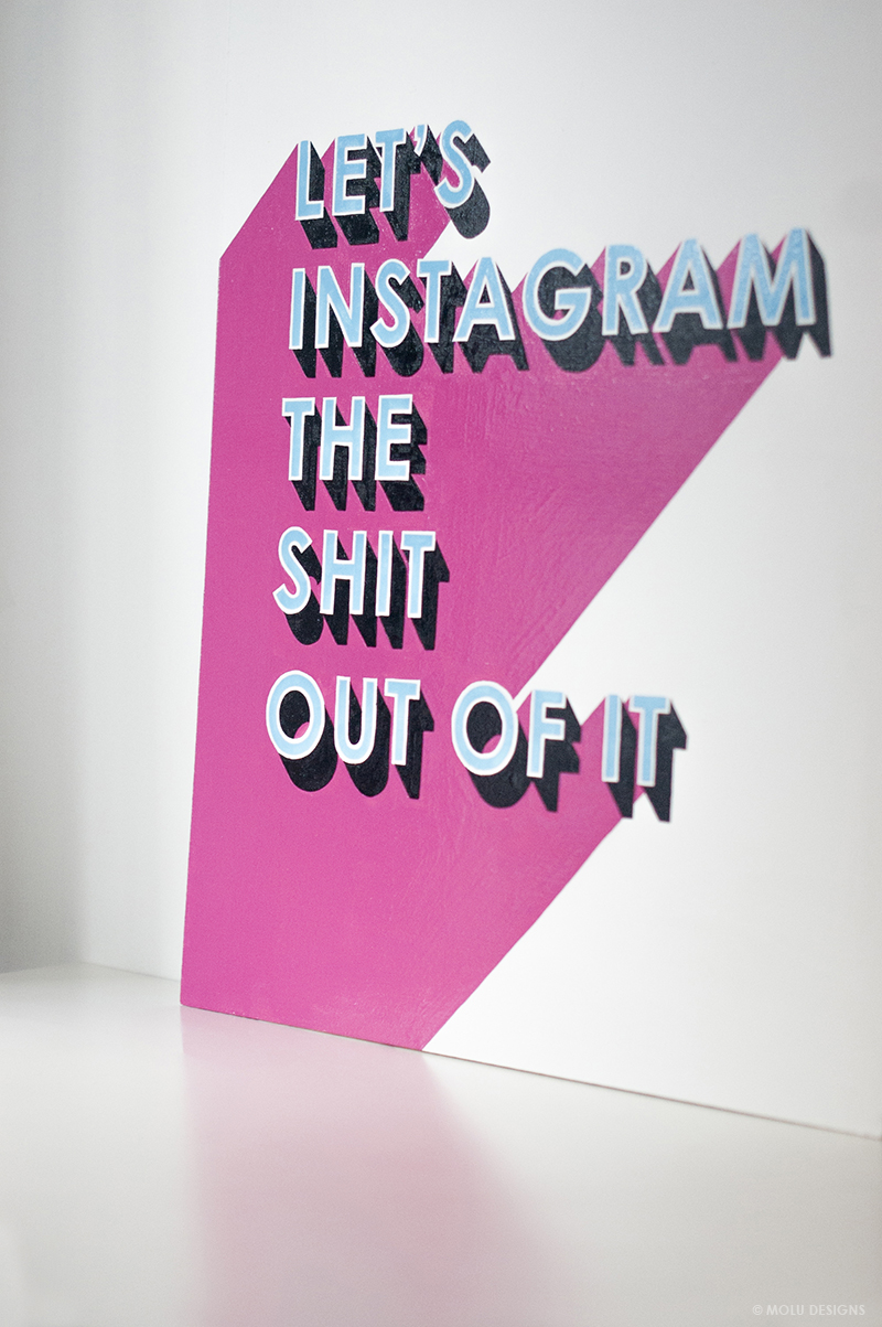
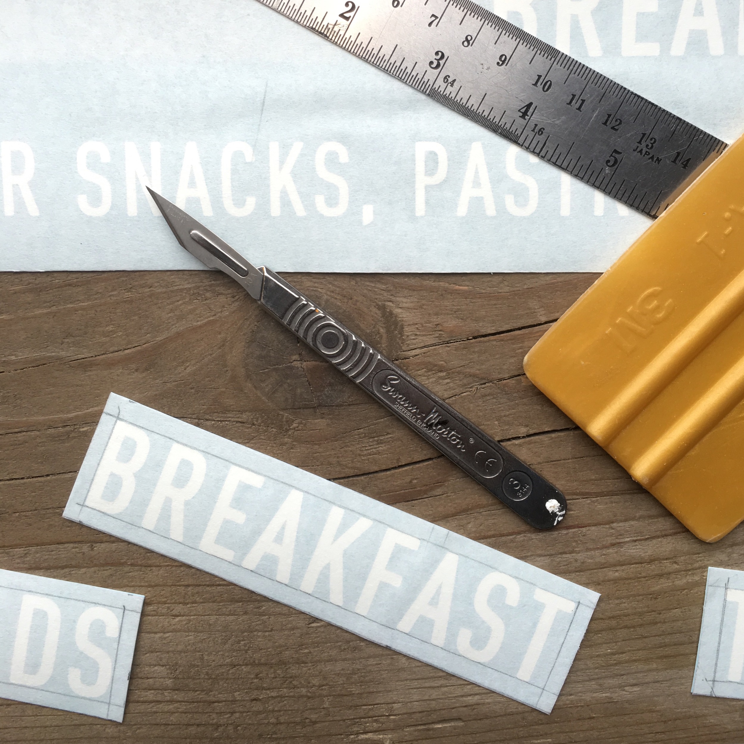
The second approach was the hand lettered element for the large picture window, that I wanted to be both fun and of course, Instgram-worthy! The "You had me at Meatballs" graphic was a playful take on the popularised catchphrase from Jerry Maguire to give passer-bys something to stop and engage with, in the hope that it leaves them wanting to know more about what goes on behind those glass panes.  And most importantly, the underlying message being that it doesn't take much for us to fall for the humble meatball! (I mean who wouldn't!?)

As for the design - I wanted this piece to explore free-hand lettering styles and compositions so that reflected both the playfulness and craftsmanship that you would find behind all the globally-inspired dishes and drinks that would be served at the restaurant. 

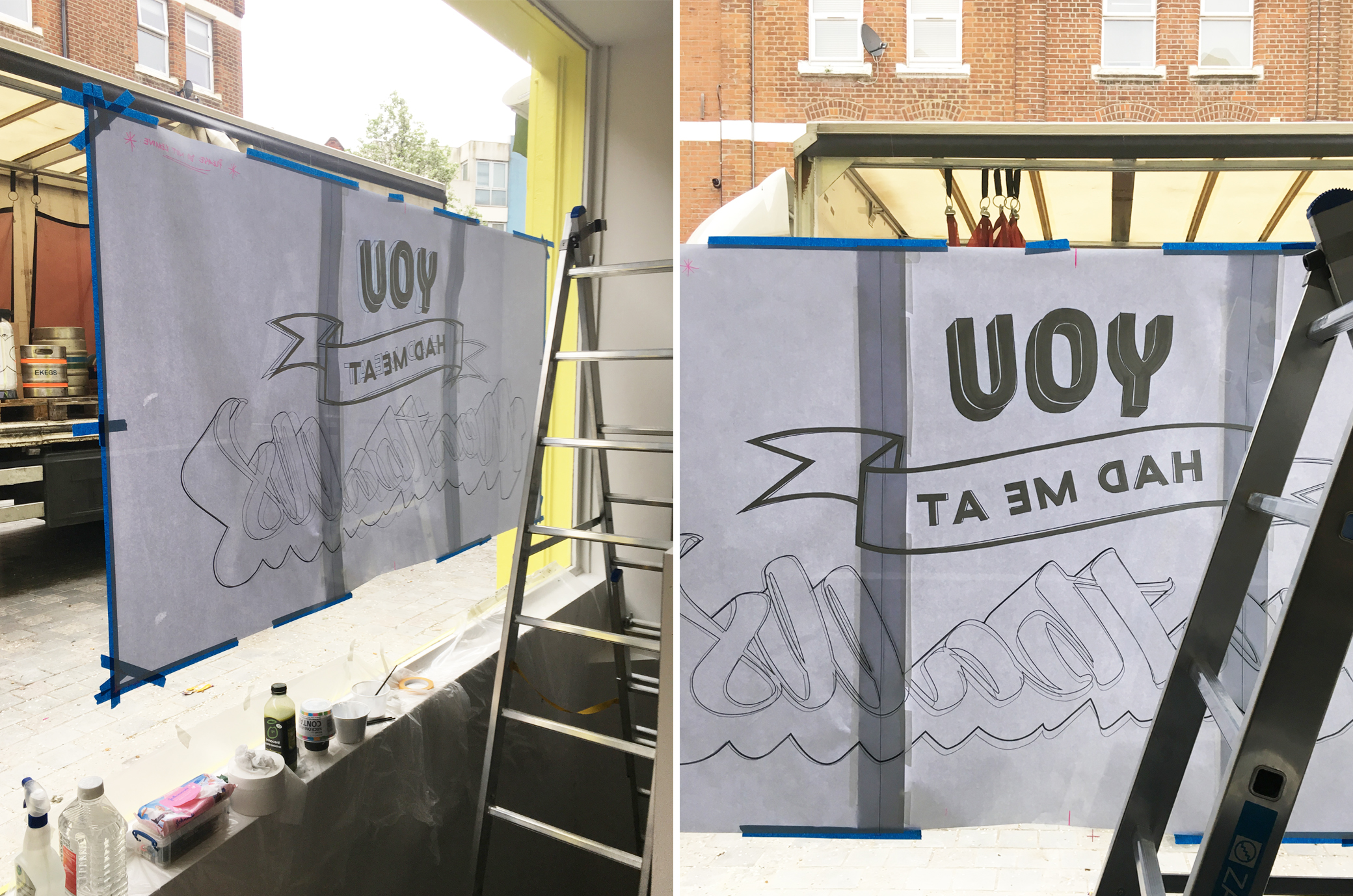
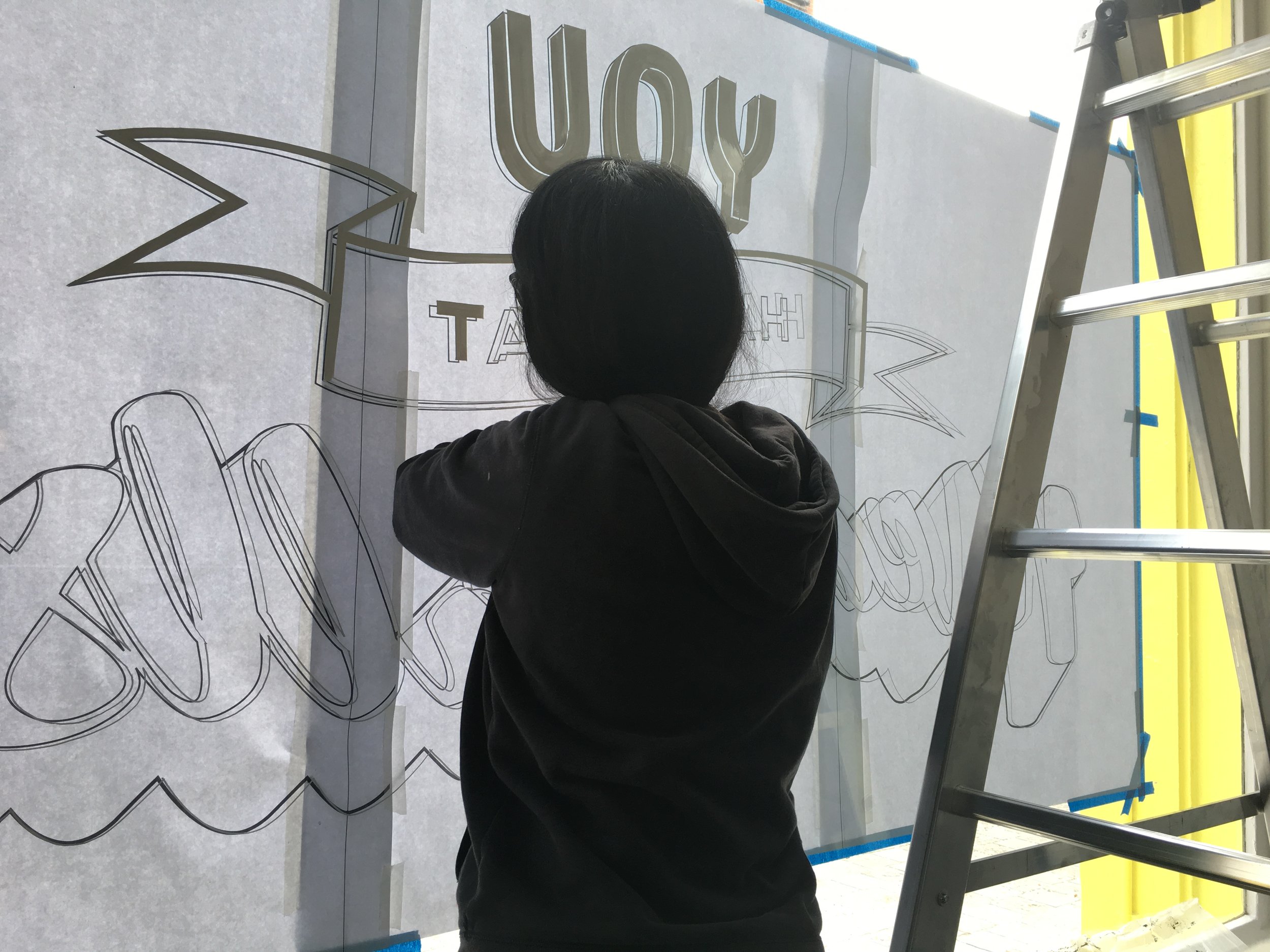
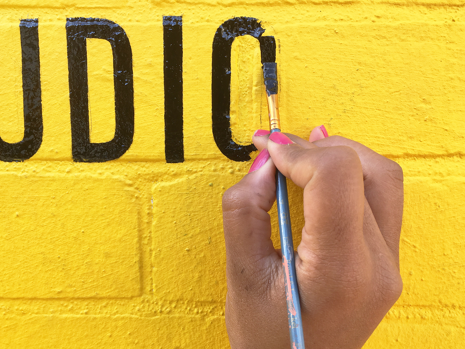
The whole job took 5days: 2days to finalise the design and 3 days to complete on site which includes all the setting up, drawing out and painting. The window graphics that spanned 2m in width, was probably the trickiest to do having had a steep and tight staircase to work from inside and decorators to work around too, but I have to say it made the job all the more satisfying seeing the finished article at the end. 

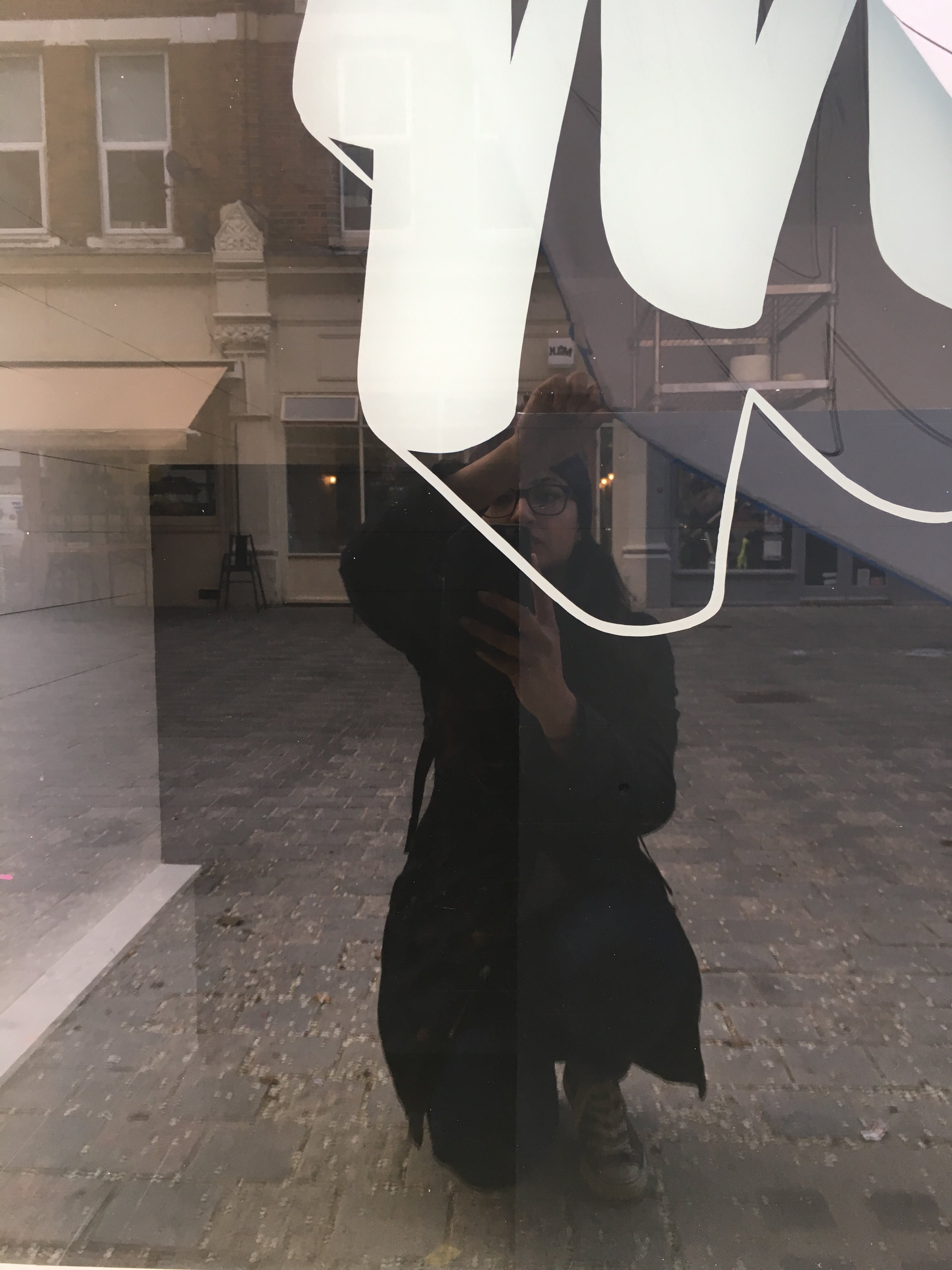
Final/official images will be coming soon to the 'Portfolio' section but in the meantime, here's a peek of how it looked a week after it's reveal. Oh and you should totally stalk their Instagram account - but be warned, it will leave you salivating... or worse, licking your screen!

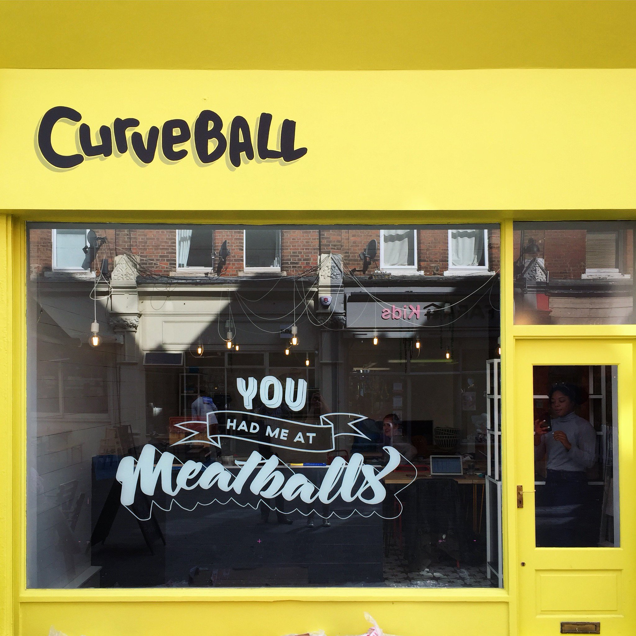
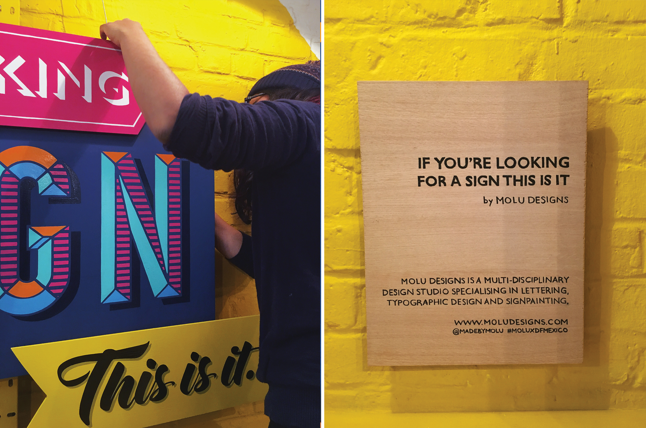
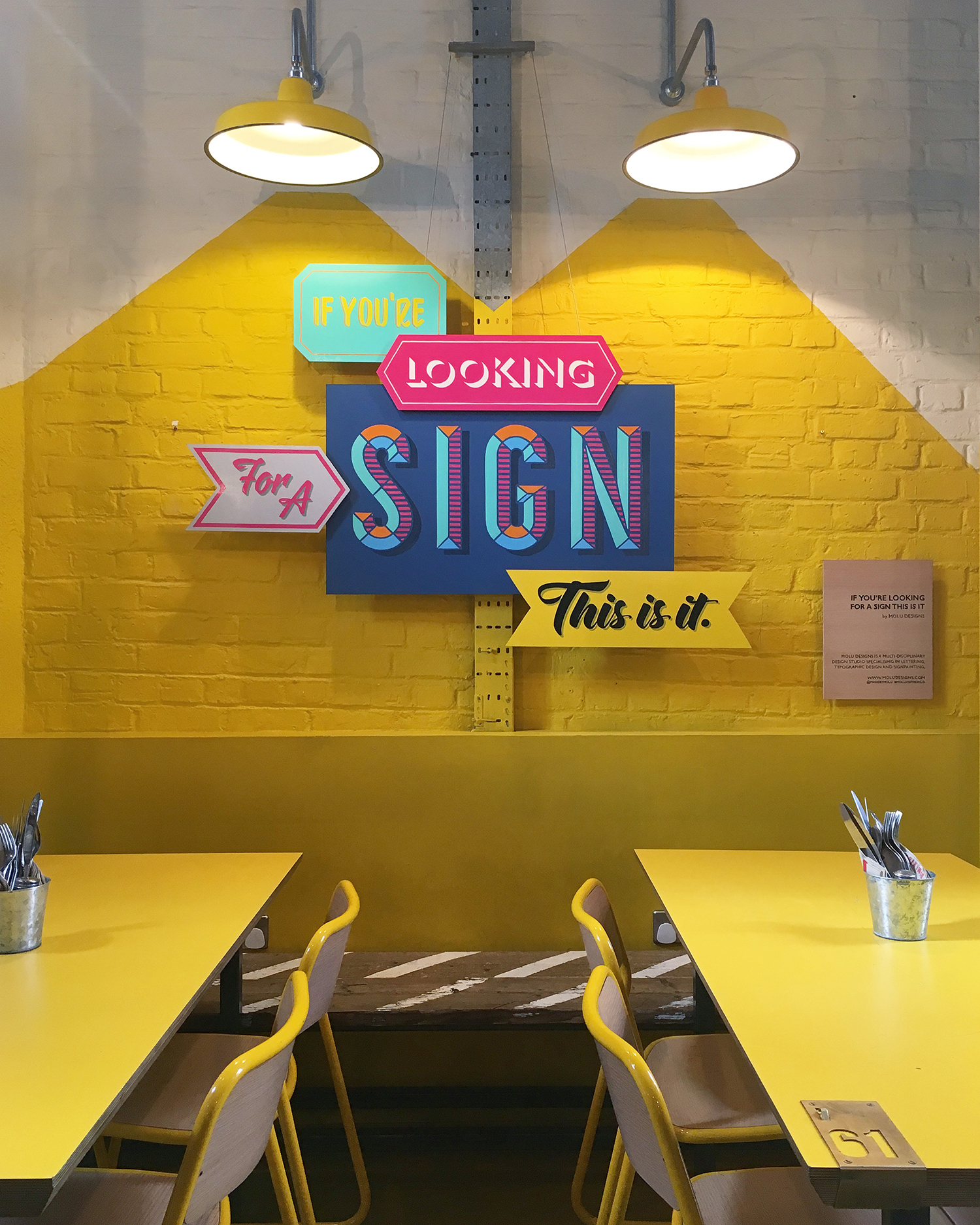
IMAGE CREDIT : Molu Designs / Hannah Pemberton

[All rights reserved ©MoluDesigns]

MOLUxDFMEXICO SIGNAGE SHOWCASE

Gosh, this post is SO long overdue! I've been meaning to share these behind-the-scenes images of one of my favourite projects of 2017 but as usual, there never seems to be enough time to do it all! Better late than never though, right?

So, here's a small glimpse of all the fun, messy and labour-intensive work that went into the final piece I did for DF Mexico back in February - especially if you missed the snippets I shared on IG and twitter back then.

This piece  was designed and created for the DF Mexico's Shoreditch premises. If you're familiar with the place, their wall by the entrance (with the striking yellow painted graphics) was simply screaming for something eye-catching. And me being me, it obviously had to be type-based and a fun catch phrase of sort, one that would stop punters in their tracks.

So, after exploring various avenues, I decided on the phrase 'If you're looking for a sign, this is it'. I love how it simple and literal it is. Not to mention being a fun, tongue-in-cheek nod to my line of work as well as being open to interpretation to all those who would encounter it. 

The key statement phrase was broken down into individual signs, where each piece explored a different lettering style using bold Mexican-inspired colours, and layered in a collage-like format.Each piece was painstakingly hand-cut, hand-lettered,&nbs…

The key statement phrase was broken down into individual signs, where each piece explored a different lettering style using bold Mexican-inspired colours, and layered in a collage-like format.

Each piece was painstakingly hand-cut, hand-lettered, hand-painted and assembled on site!

So there you have it!

If you're ever in Shoreditch by Truman Brewery, do stop by and check it especially over their awesome tacos and frozen margaritas!! We've had many folk tweet and instagram it already, so if you're on social media do share all your amazing pics using the tag #MOLUXDFMEXICO a long with @madebymolu and @dfmexicodiner so we can all have a nosey!

Official photos can be found here.


IMAGE CREDIT : Molu Designs

[All rights reserved ©MoluDesigns]

FIG ROW STUDIO ENTRANCE SIGNAGE

Last week, I worked on an entrance signage for the studio in Limehouse. The rather weathered frontage had been aching for a lease of life so I proposed the idea of creating a bold, bright and statement entrance using a yellow, black and grey as the primary colour palette. 

The design was kept relatively simple with the entranceway as the focal point. Taking key points around the doorway, I mapped out a bold geometric shape which I then blocked out in bright yellow masonry; from the walls and doors to the concrete floor. I kept the typeface for the studio name clean and minimal, which I hand-painted in black and included a grey drop shadow to give it an even stronger and punchier look.

I absolutely loved working on this project for it's scale and overall simplicity which worked out a lot more effectively in the end. The yellow totally makes it! All in all, it took 3.5days for the entire job (from initial design sketches to production) and was lucky enough to have good weather for it too!

I will be taking more professional shots to add to my portfolio section, but in the meantime, here are a few behind-the-scenes images of me at work! 

IMAGE CREDIT : Molu Designs

IMAGE CREDIT : Molu Designs

APR - JUNE REVIEW

A little round up of what's been taking place behind the scenes in and out of the studio (from freelance work to private commissions) over the last there months. Oh I do love the range of work I get....especially when it's so hands on! 

IMAGE CREDIT : Molu Designs

LET'S INSTAGRAM

Currently working on a series of custom-made typographic signs which I'm hoping to put on the market this year. Similar to my prints, these signs will be inspired by fun, uplifting quotes and graphics that would suit both the home and workplaces. This first one, was coined by my husband as a response to my Instagramming (and general photographing) obsession....so I couldn't help but design and paint it! Pretty sure, many of you will relate!

So yea, let me know what you think - there's more in the pipeline! 

Enamel lettering paint on base-coated MDF board (Size 420x594mm)

IMAGE CREDIT : Molu Designs

IMAGE CREDIT : Molu Designs

JAN - MAR REVIEW

A little round up of what's been taking place behind the scenes in and out of the studio (from freelance work to private commissions) over the last there months.