MOLU DESIGNS
MOLU DESIGNS

NEWS

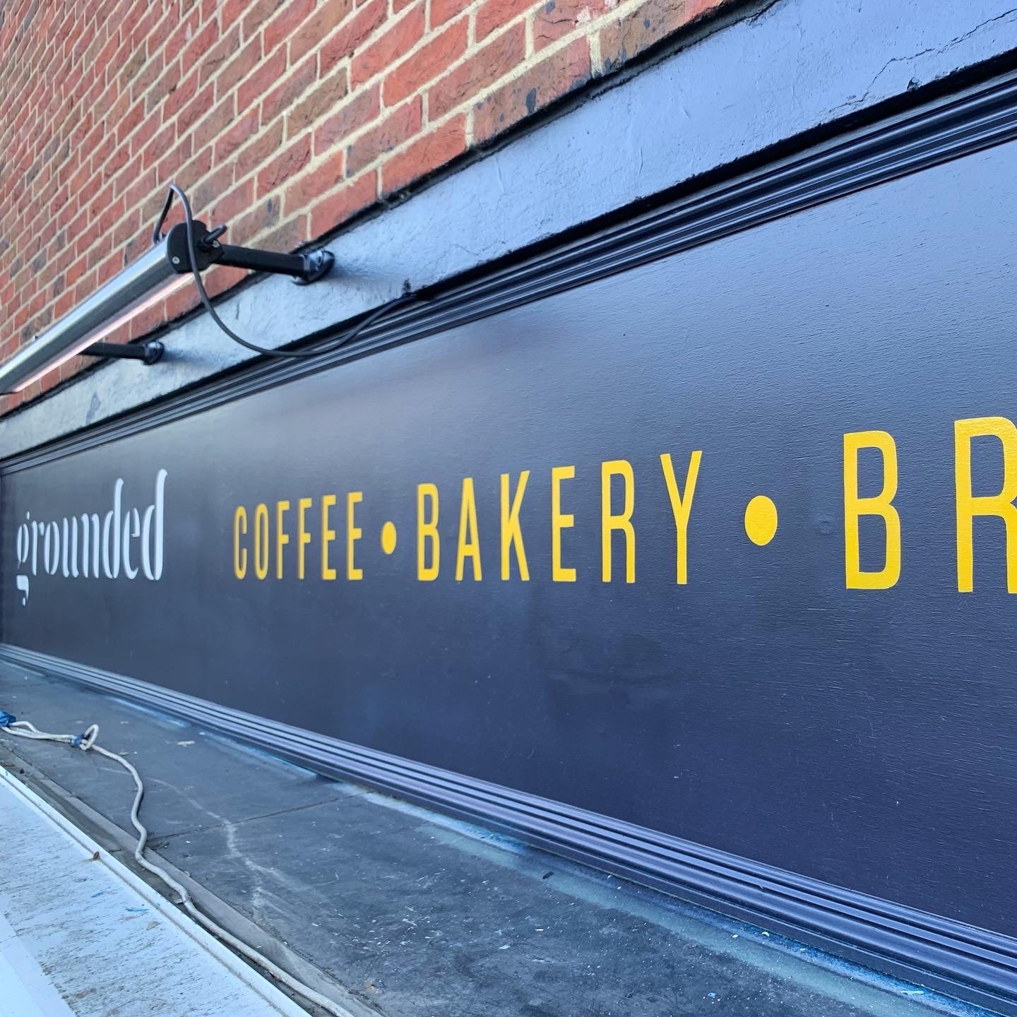
MURALS FOR GROUNDED CAFE, BROMLEY

Two large murals and shopfront signage work for the new coffee and brunch spot in Hayes, @grounded_social!

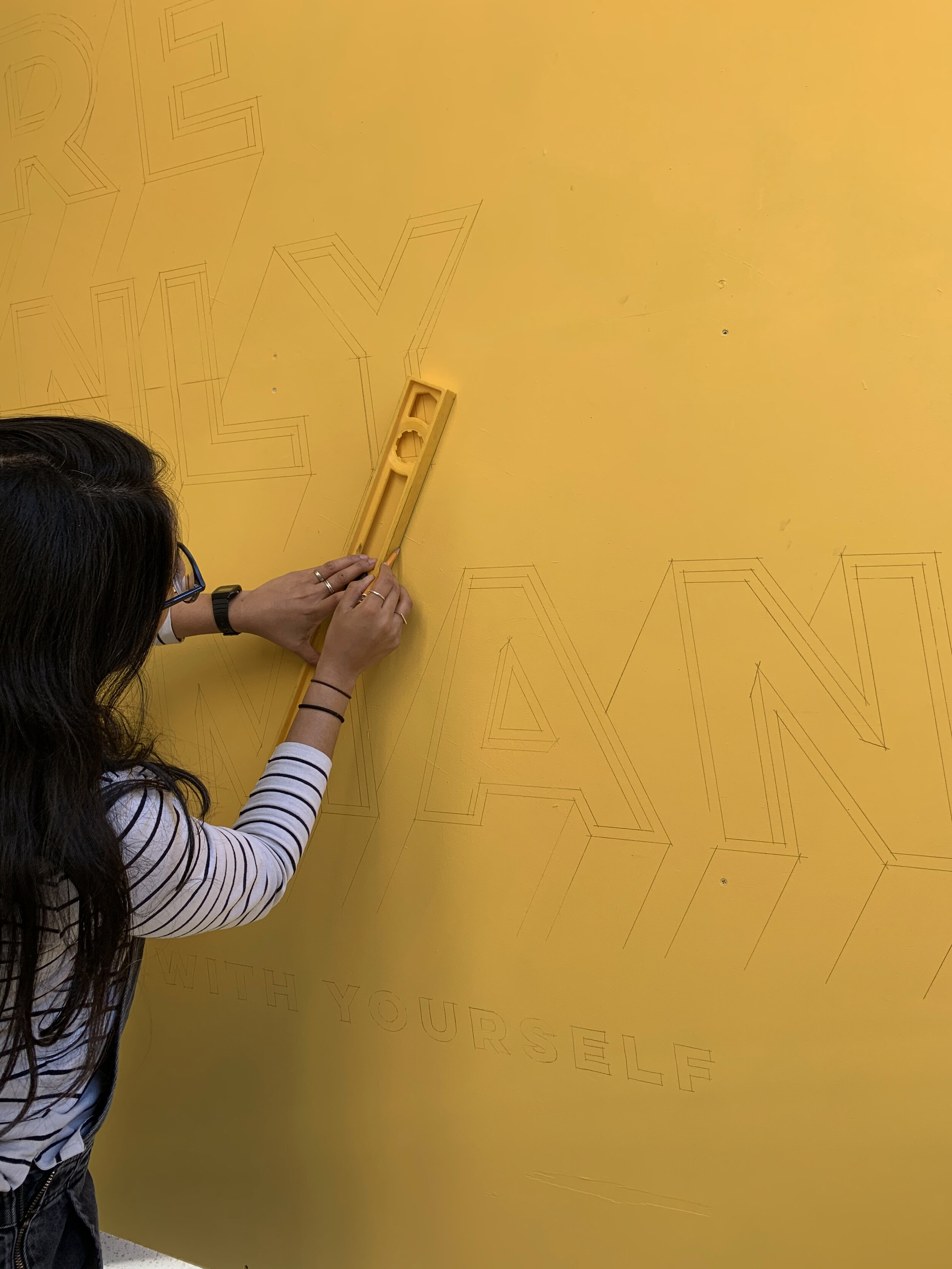
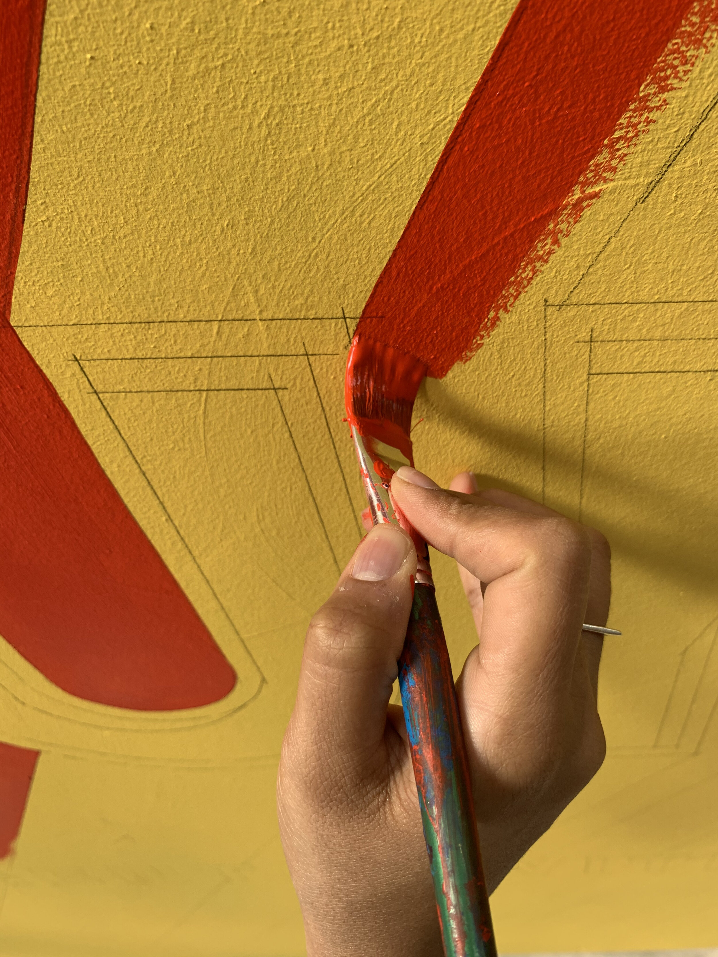
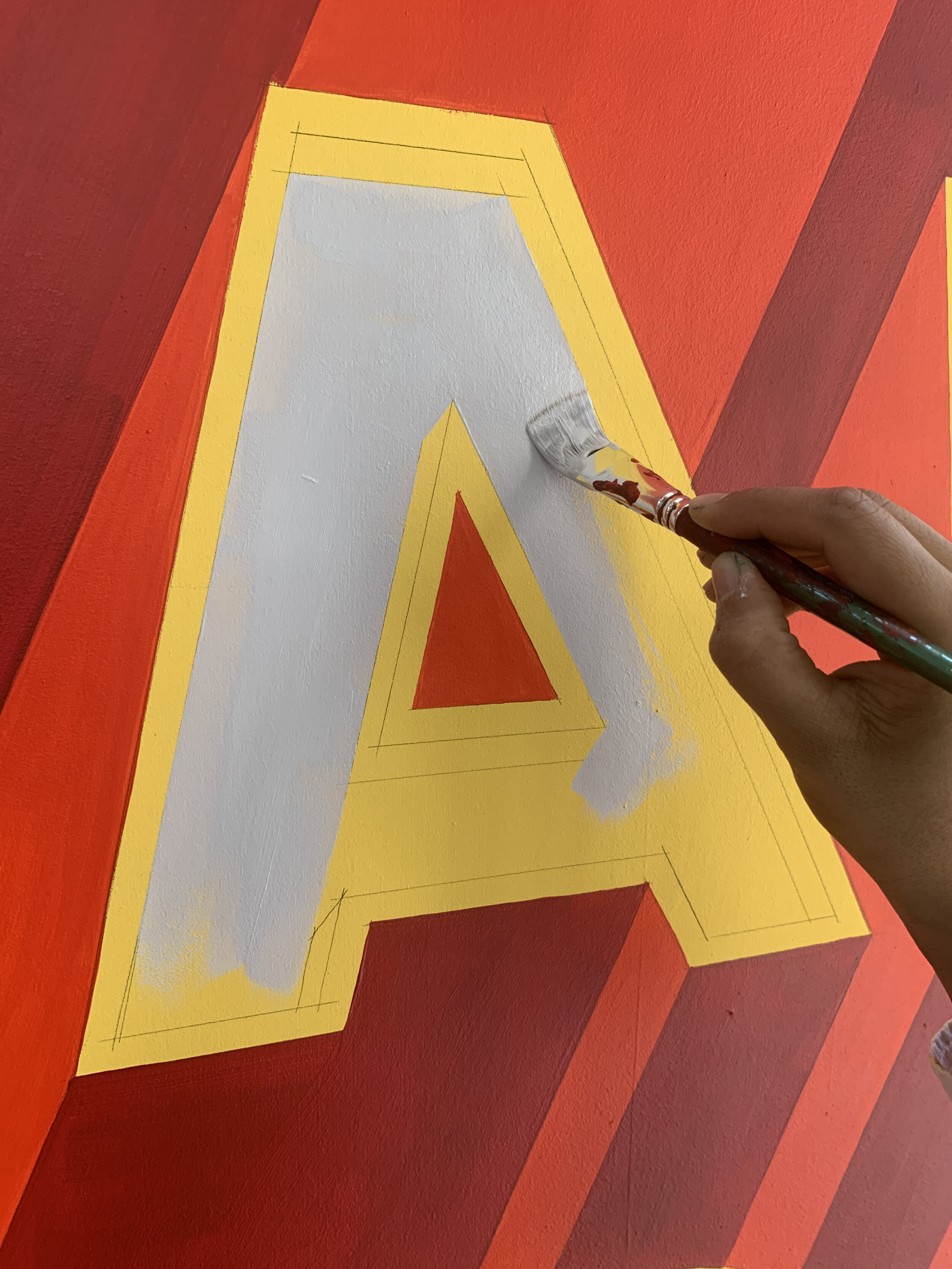
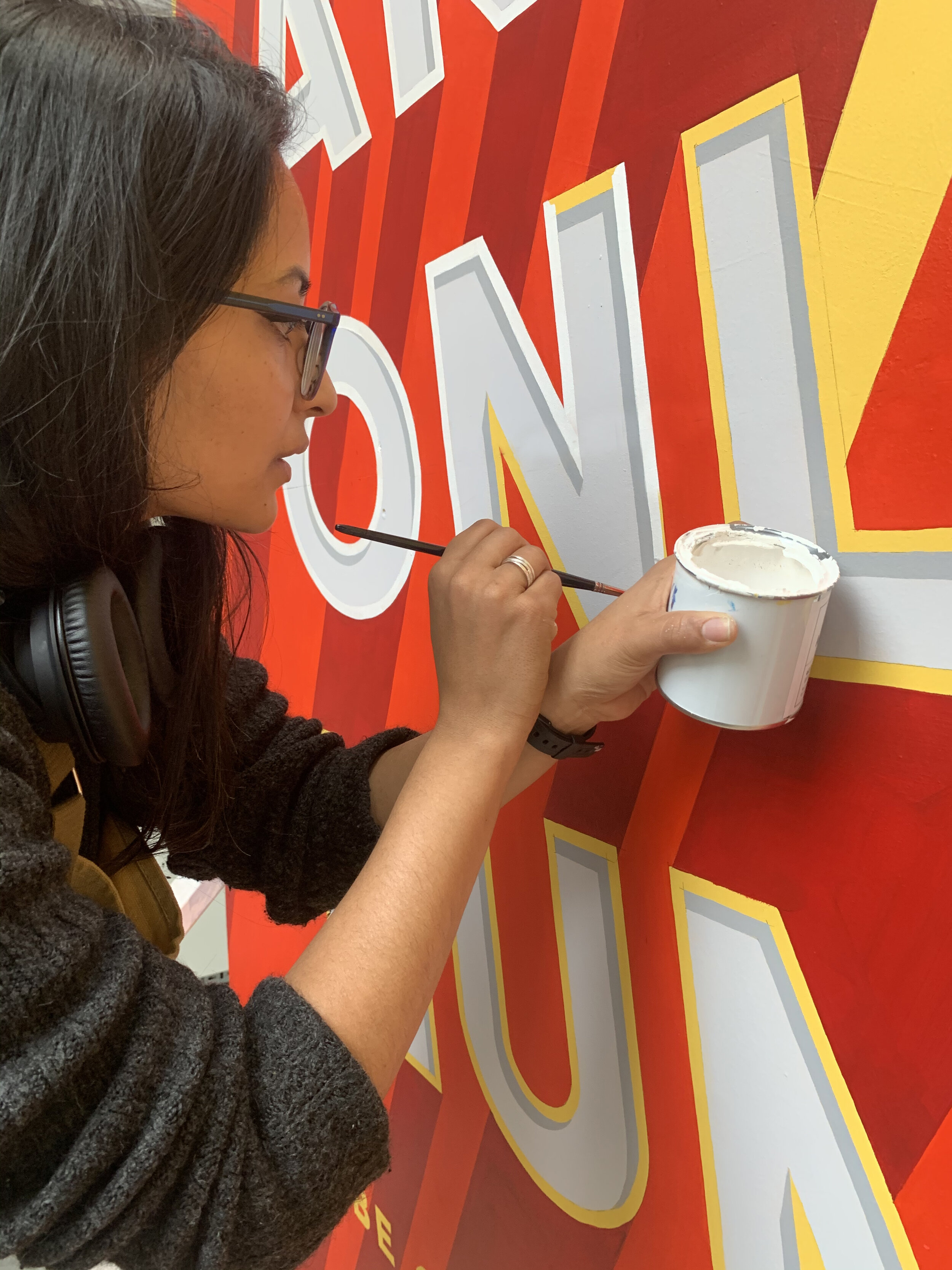
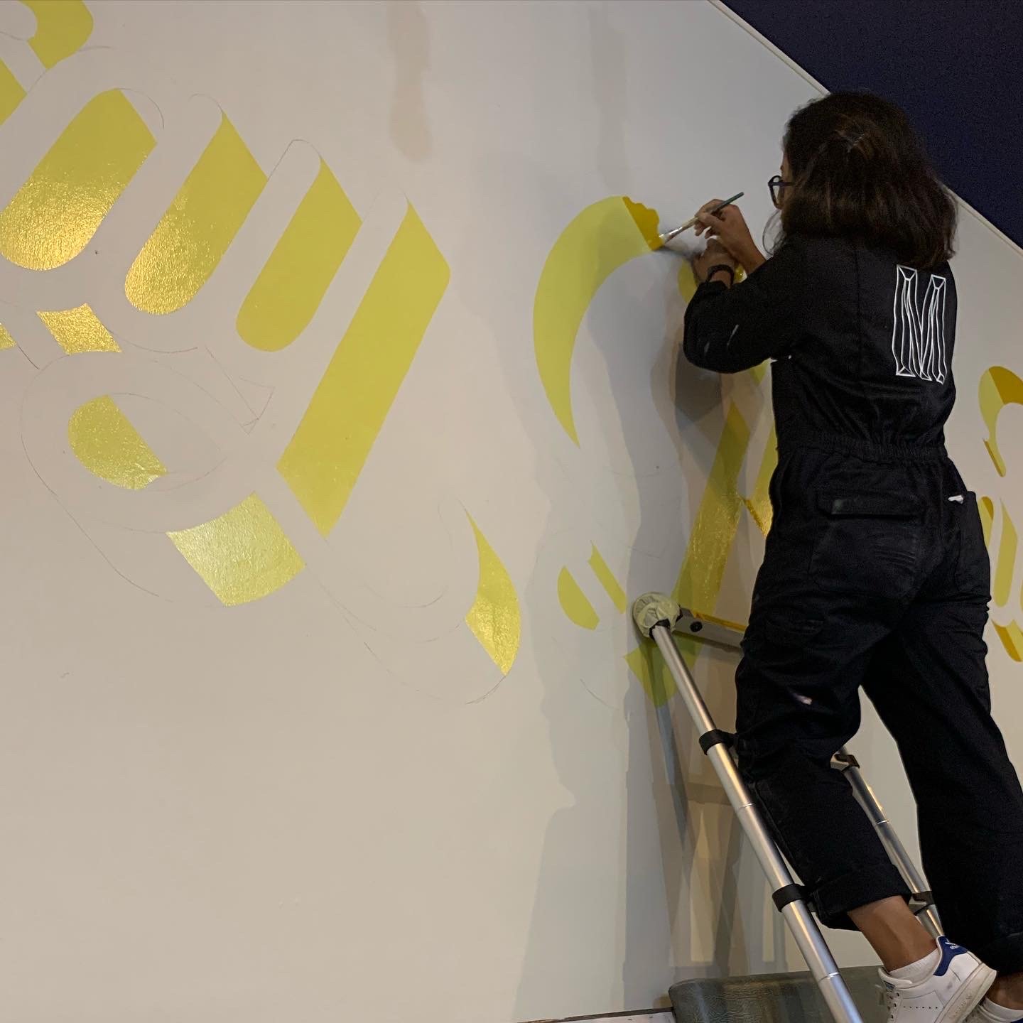
The client had two large wall spaces on both floors of her new unit and asked that two statement’s she had in mind were turned into two statement murals for each floor. The bottom floor being the coffee shop bore the words “STAY GROUNDED” and the top floor, being the event space and bar, bore the words “ I CAME HERE FOR LOVE”.

Both murals (roughly 7.5 - 8m spans) took on the same lettering style but applied in two different approaches for two different vibes. One the course of two weeks, the design concepts for the mural were proposed and finalised. It then took three days to draw out and paint the ground floor mural on site while the top floor one took a full week to draw out and paint.

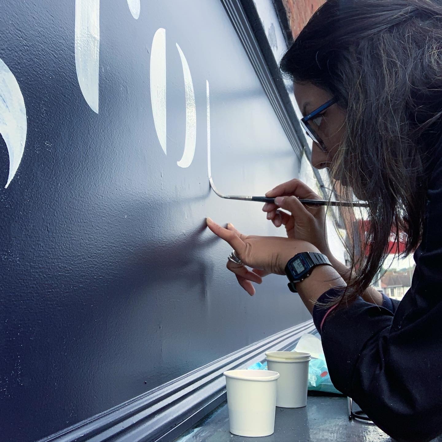
This project was such a joy to work mostly because I lucked out on a client who gave me full rein over the designs and totally trusted me to deliver her vision.

If you’re ever in Hayes, Bromley do stop by and visit. Their coffee and baked goods are to die for….and if you’re sat in front of the murals, then do share and tag us! In the meantime, enjoy these timelapse videos of the two murals in the making!

IMAGE CREDIT : Molu Designs
[All rights reserved ©MoluDesigns]

Molu DesignsComment

Squarespace murals get featured on DAZED!

Exciting news - the big Squarespace mural art project that I was part of has been featured on Dazed magazine!
To read the full article and watch the short film (featuring some of us artists), click HERE!

Molu DesignsComment

Background Bob x MOLU collab

So pleased to reveal this piece I created in collaboration with @background_bob. This is a another beautiful lockdown art project that kicked off during the first lockdown last year and it has since become a global movement! Artists were invited to add their mark to the boards that had been painted by the wonderful Noah (aka Background Bob)...and well, the rest is history.

Young Noah has Hydrocephalus, Epilepsy and Cerebral Palsy which involved a lot of time in hospital during his early years so, through auctioning off these pieces, this project helps raise funds for Colchester Hospital, where Noah spent most of his time at.

I’m humbled and honoured to be a part of another great cause with such amazing community spirit. This was my entry, where obviously being a typoholic, I had to play on it with a bit of tongue-in-cheek. I wanted Noah’s brushstrokes and colours to be at the forefront so decided to block out the background so it only shone through the letters. I kept this in an imperfect whitewashed way so the letters stood crisp against it and you could still faint glimpse of it. You’ll see the process if you swipe through to the end!

I’ve had so much fun with it and grateful to be a part of this special journey. More to come on this later this year so do stay tuned! And there’s other pieces by other artists that’s def worth checking out over on their account!

Thank you again @background_bob!!

IMAGE CREDIT : Molu Designs
[All rights reserved ©MoluDesigns]

Molu DesignsComment

Mini Murals Series - Part 2

YAOH 01

Here it is! The finished mural of my @ingoodcompanyleeds #postersforthepeople artwork!
It would have taken 5 solid days from start to finish but I spread it over a few weeks to fit it around various other commitments.

Also, If you’d like to see the whole behind-the-scenes working process condensed into a 4min video click HERE

Remember....“YOU ARE ONLY HUMAN; be gentle with yourself

IMAGE CREDIT : Molu Designs
[All rights reserved ©MoluDesigns]

Molu DesignsComment

POP BRIXTON DESIGN ENTRY

A last minute entry for Pop Brixton’s competition for a newly revamped look for the premise in Brixton.

Drawing inspiration from Kind Studio’s colour palette and afro-carribean prints, the design is a simple yet bold and playful transformation of the existing surface, accentuating the geometric forms of the facade.

Bearing in mind that this is a key focal point when entering the premises and a key backdrop to the main square, it was imperative that the design and logo stood out whilst still complementing all the surrounding structures, fabric and overall aesthetics of the outdoor space. The bold colour blocking approach minimises any unwanted distractions to the eye but one that would act as a statement piece against the bustling nature of the space. The intention of the proposed design is to encapsulate the energy of Brixton’s diverse multicultural community -  fun, relaxed and bold - that would connect across all generations and backgrounds.

Despite being a strong contender, we sadly didn’t get the commission. Better luck next time hopefully!

IMAGE CREDIT : Molu Designs
[All rights reserved ©MoluDesigns]

 
Molu DesignsComment

A colouring book celebrating BAME artists!

“GROW THROUGH WHAT YOU GO THROUGH”

I’m excited to finally share this piece I designed a while back that’s now part of a colouring book! Commissioned by @aireplacestudios and curated @bhakti, the colouring book showcases various different artworks by a fabulous pool of BAME creatives, which will be hitting various local community groups in Leeds.

The theme was on “experience”. I based mine on one of my favourite quotes where I truly believe, that it’s the experiences we have in life (both good and bad) that shape the way we become and how we see the world. It’s a statement that really resonates with me personally and I wanted to create something that was quite nature inspired - not just because it radiates growth and positivity but because like nature, the course of our growth is somewhat untamed and uncertain, yet in the bigger picture there’s still so much beauty in it. I wanted the artwork to be bold so it reminds us to stop and look deep within us to realise the beauty within our own growth.

If you’d like copies of these, let me know and i’ll hook you up! :)

Molu DesignsComment

Cover graphics for Della B band

I’m excited to share these four hand-lettered and digitally rendered artworks created for indie rock band @dellabband to showcase their the newly released tracks. They wanted the designs to resonate every bit of 70s nostalgia so careful thought was put into the style of the letterforms and colour ways.

What do you think?

IMAGE CREDIT : Molu Designs
[All rights reserved ©MoluDesigns]

Molu DesignsComment

#36daysoftype

Putting together all the letterforms I designed for this year’s #36daysoftype challenge on over on Insta. What do you think?
The retro summer vibe seems so apt now with our mini heatwave. Hope y’all stay cool this week!

IMAGE CREDIT : Molu Designs
[All rights reserved ©MoluDesigns]

Molu DesignsComment