POP BRIXTON DESIGN ENTRY

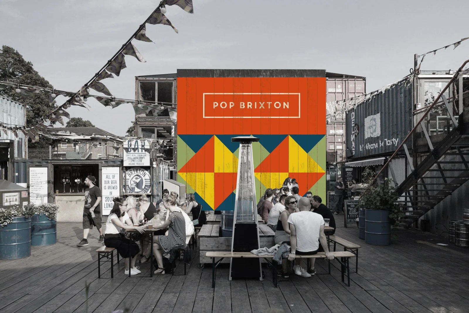
A last minute entry for Pop Brixton’s competition for a newly revamped look for the premise in Brixton.
Drawing inspiration from Kind Studio’s colour palette and afro-carribean prints, the design is a simple yet bold and playful transformation of the existing surface, accentuating the geometric forms of the facade.
Bearing in mind that this is a key focal point when entering the premises and a key backdrop to the main square, it was imperative that the design and logo stood out whilst still complementing all the surrounding structures, fabric and overall aesthetics of the outdoor space. The bold colour blocking approach minimises any unwanted distractions to the eye but one that would act as a statement piece against the bustling nature of the space. The intention of the proposed design is to encapsulate the energy of Brixton’s diverse multicultural community - fun, relaxed and bold - that would connect across all generations and backgrounds.
Despite being a strong contender, we sadly didn’t get the commission. Better luck next time hopefully!
IMAGE CREDIT : Molu Designs
[All rights reserved ©MoluDesigns]