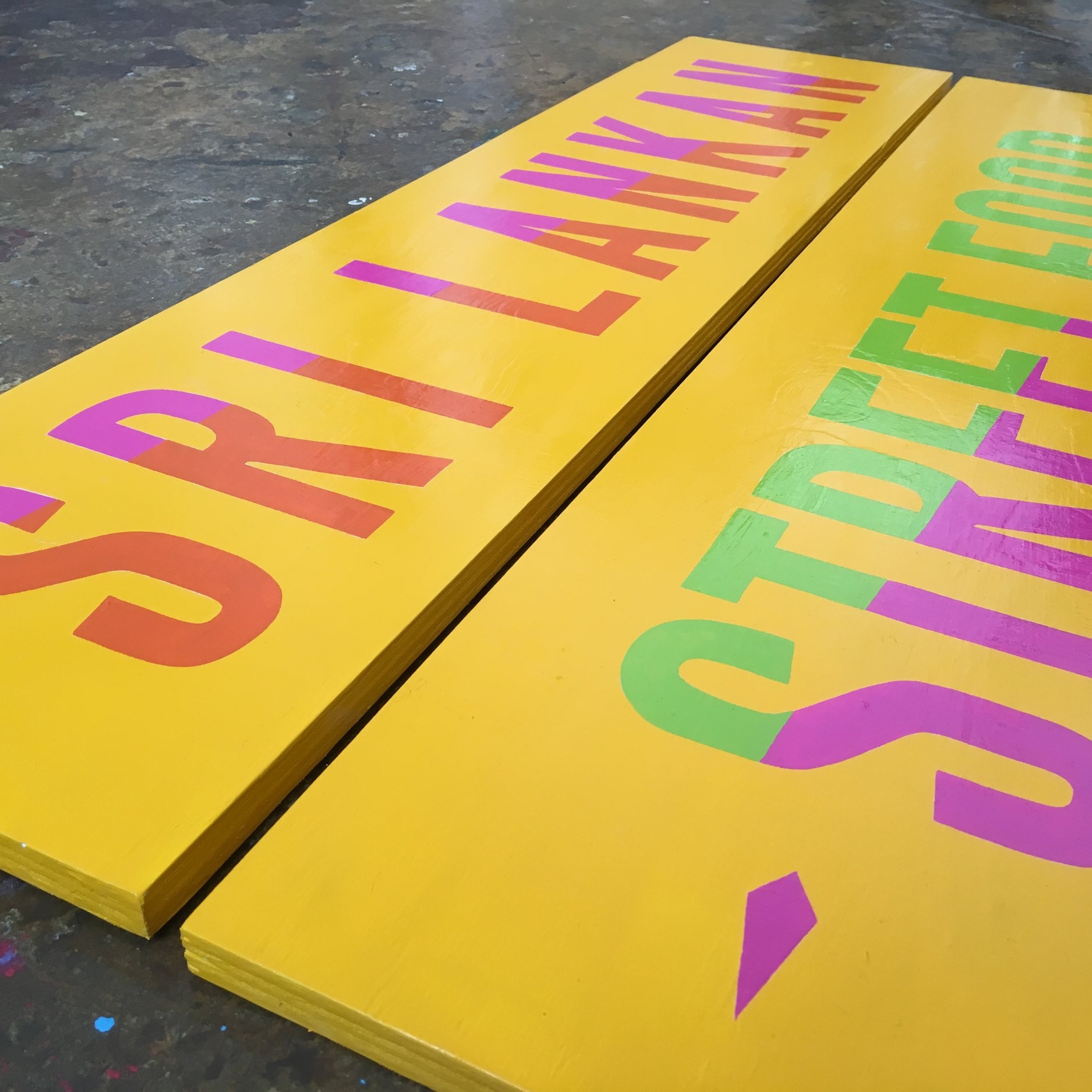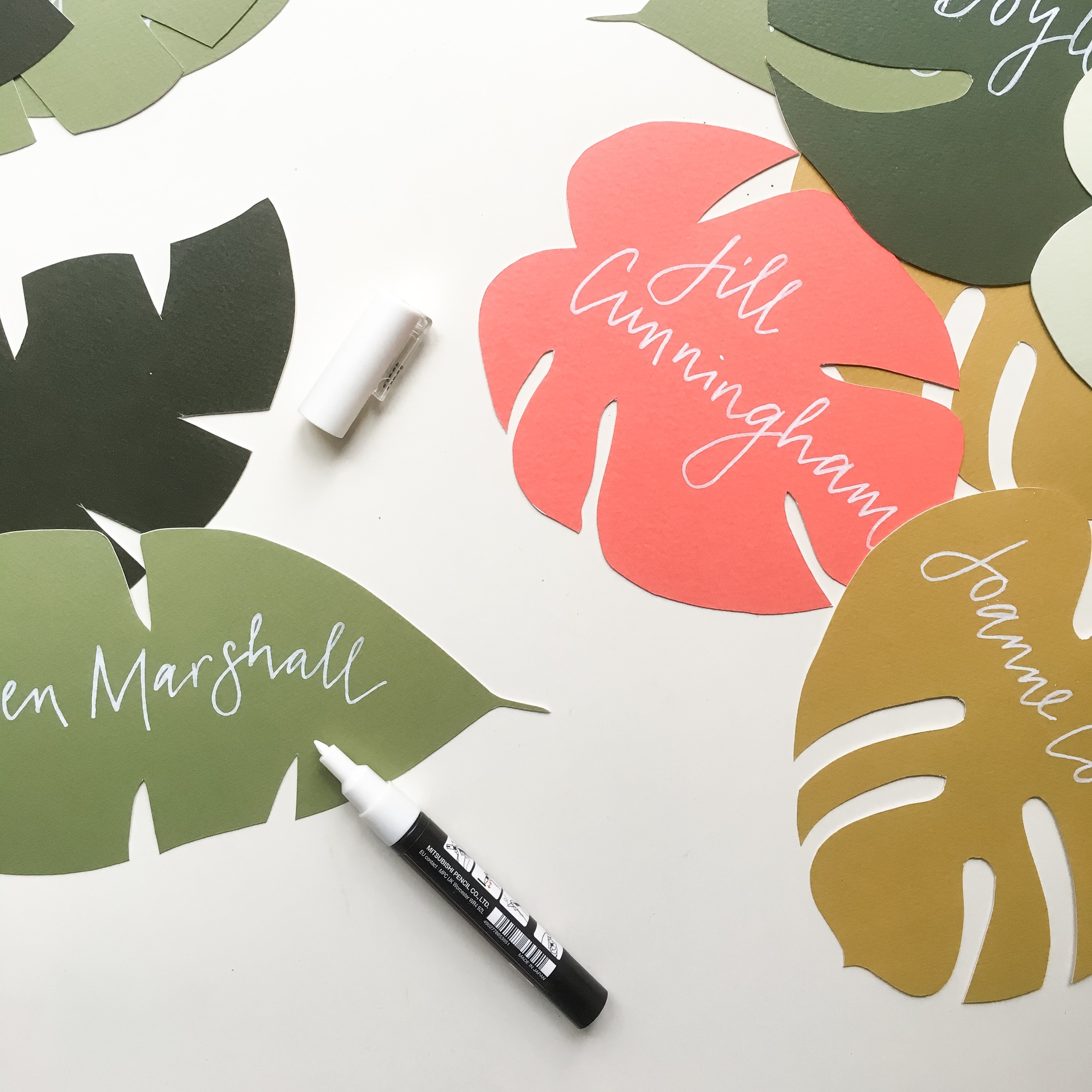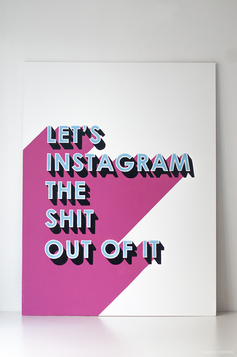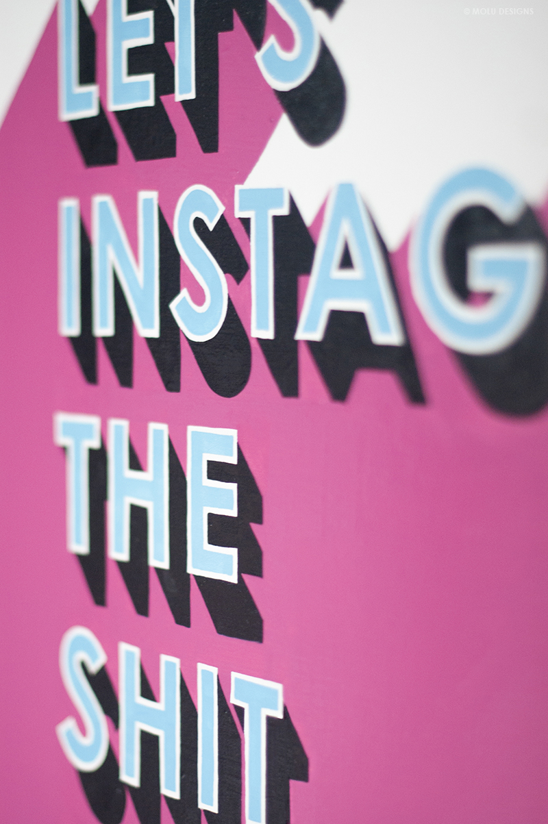
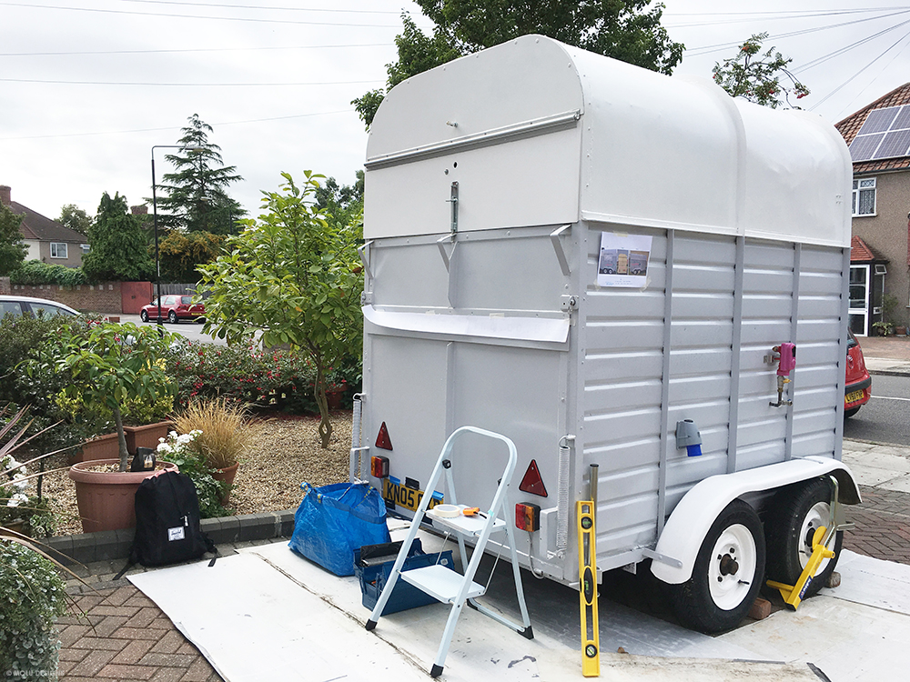
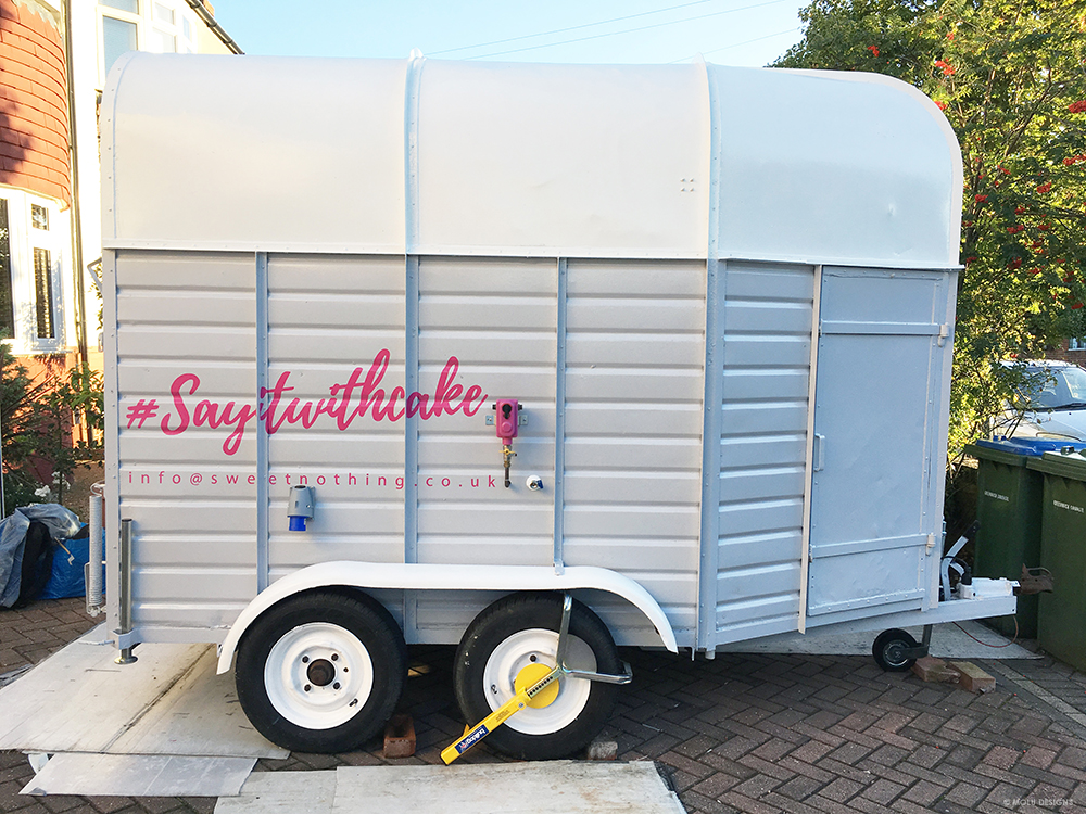
This little project was such a delight to work on a few weeks ago. The client had transformed a small horse trailer for her catering business, Sweet Nothing so I was appointed to do the lettering across three sides, as the first phase to this project.
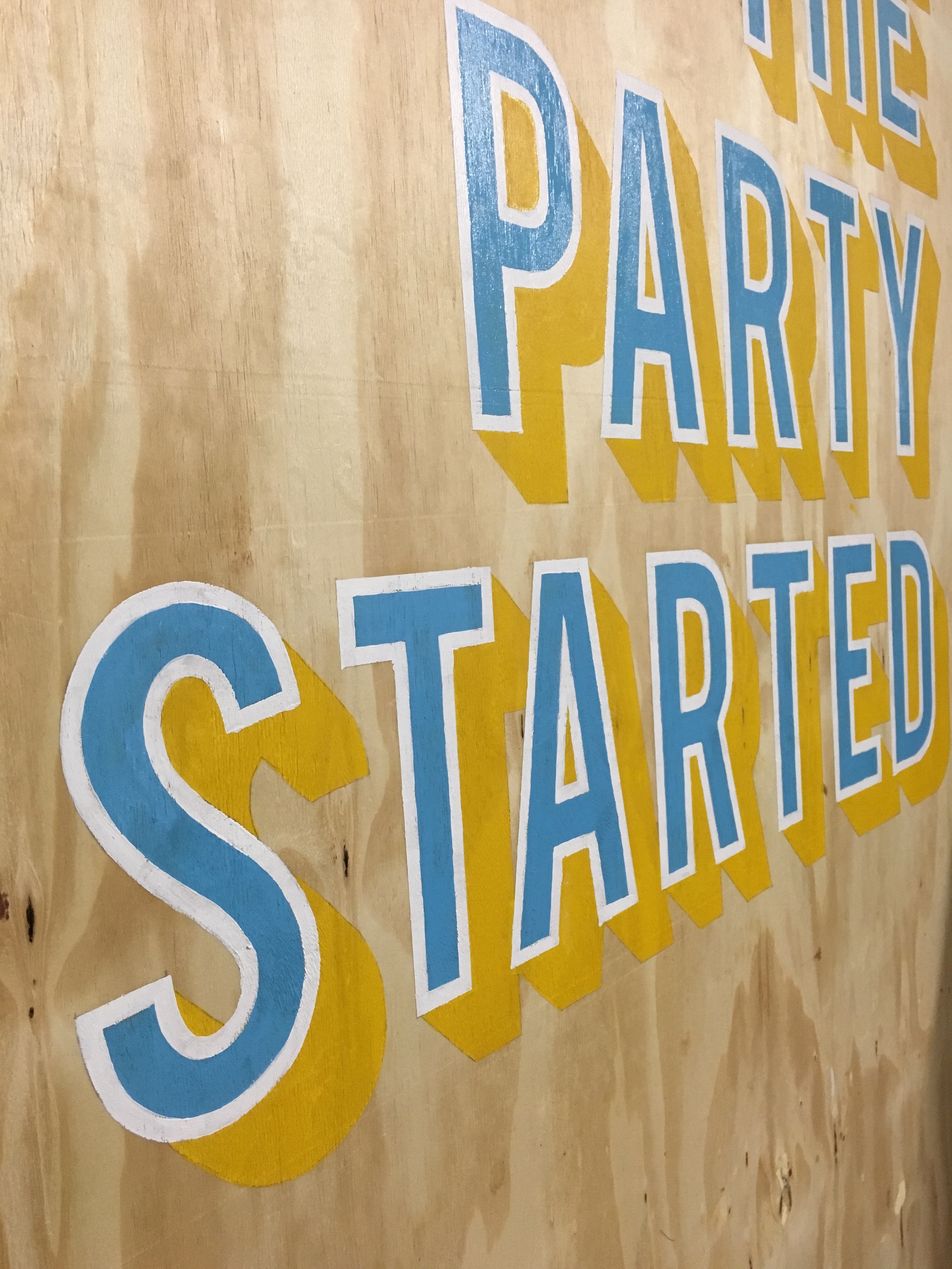
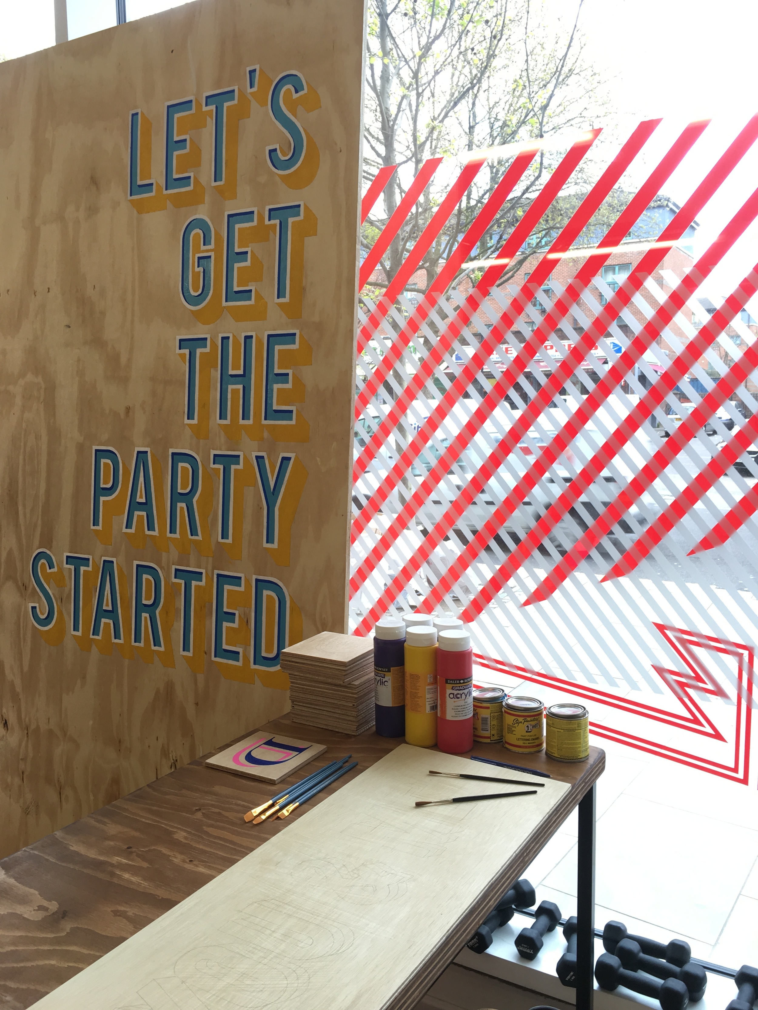
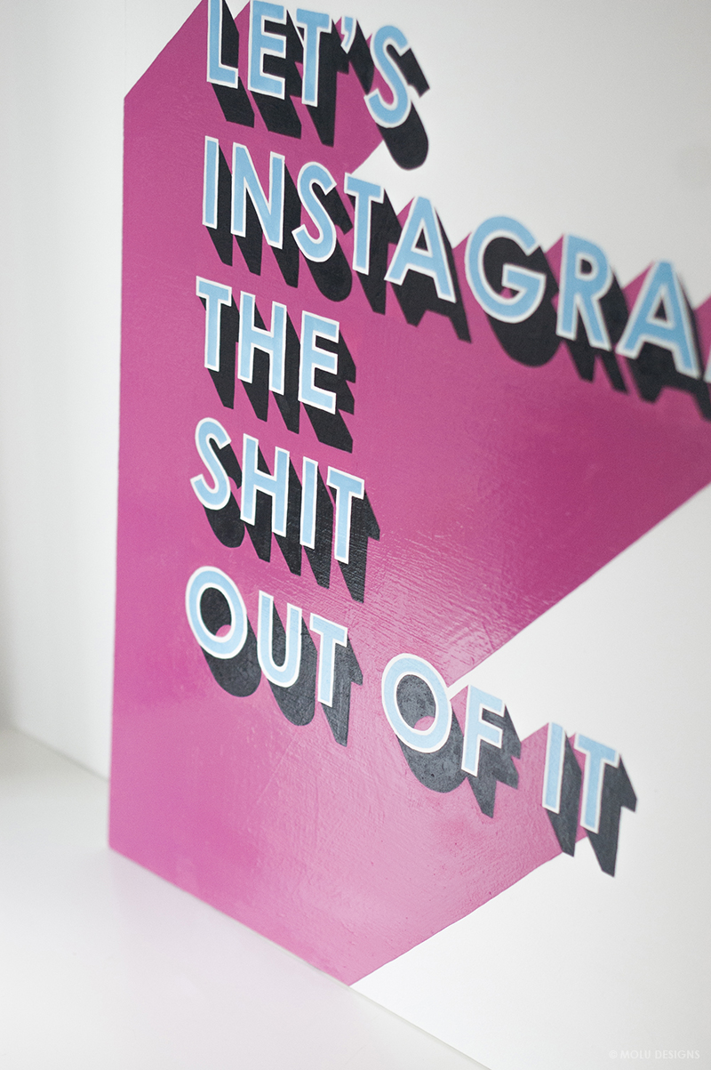
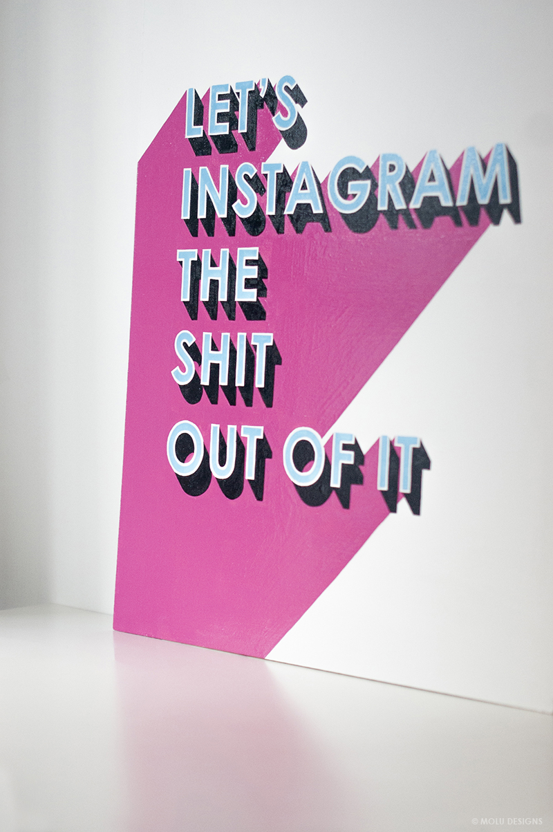
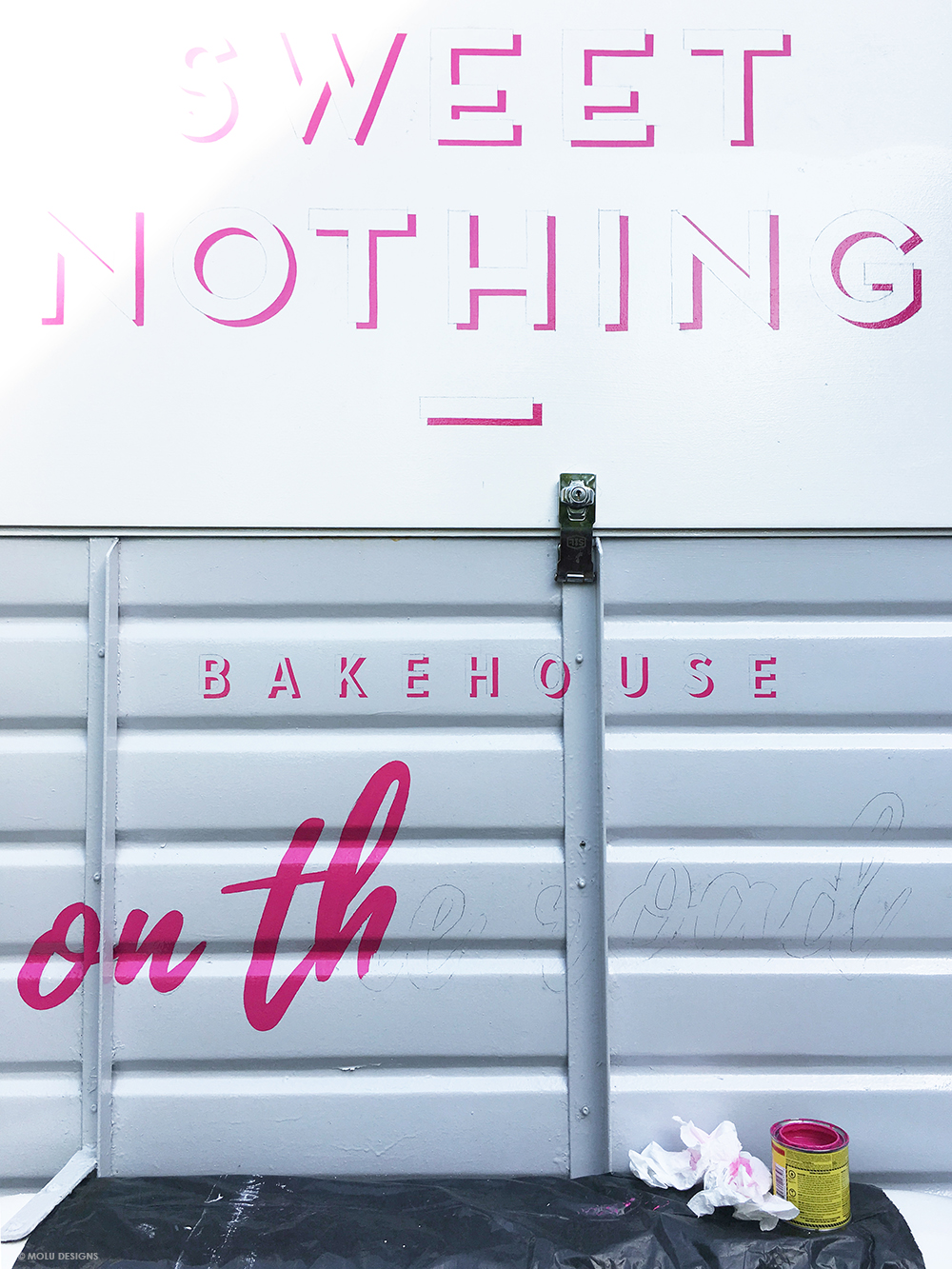
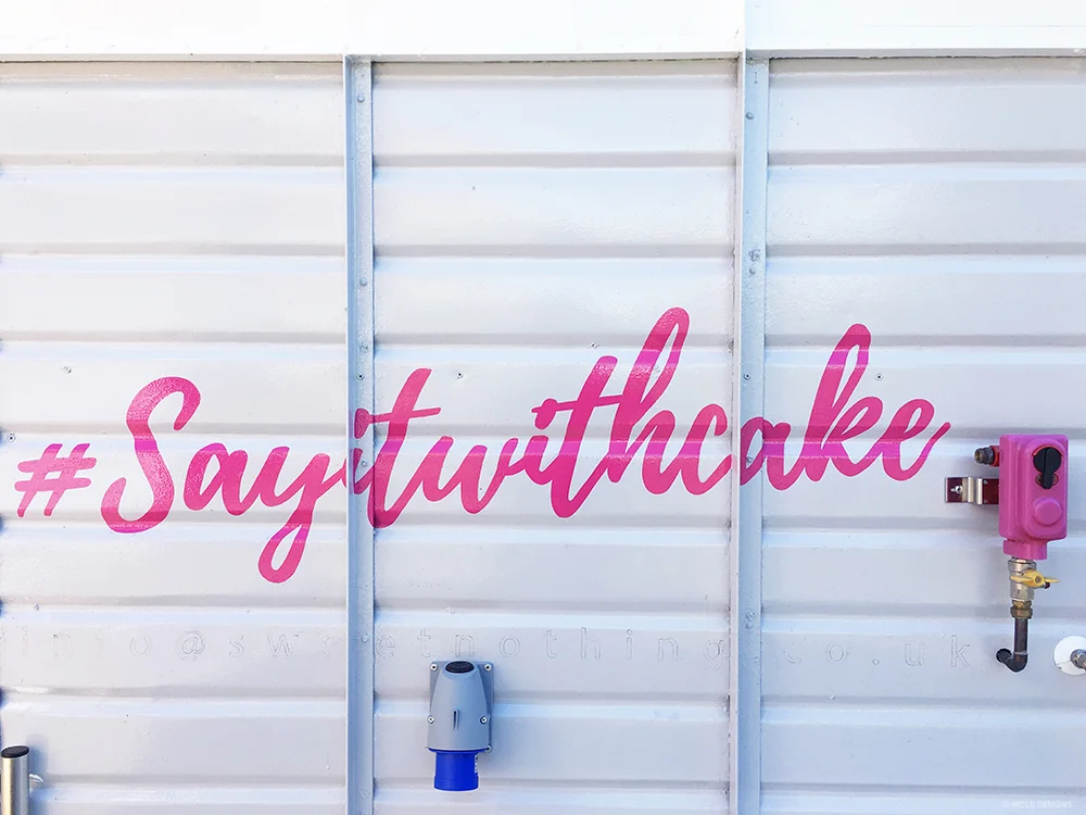
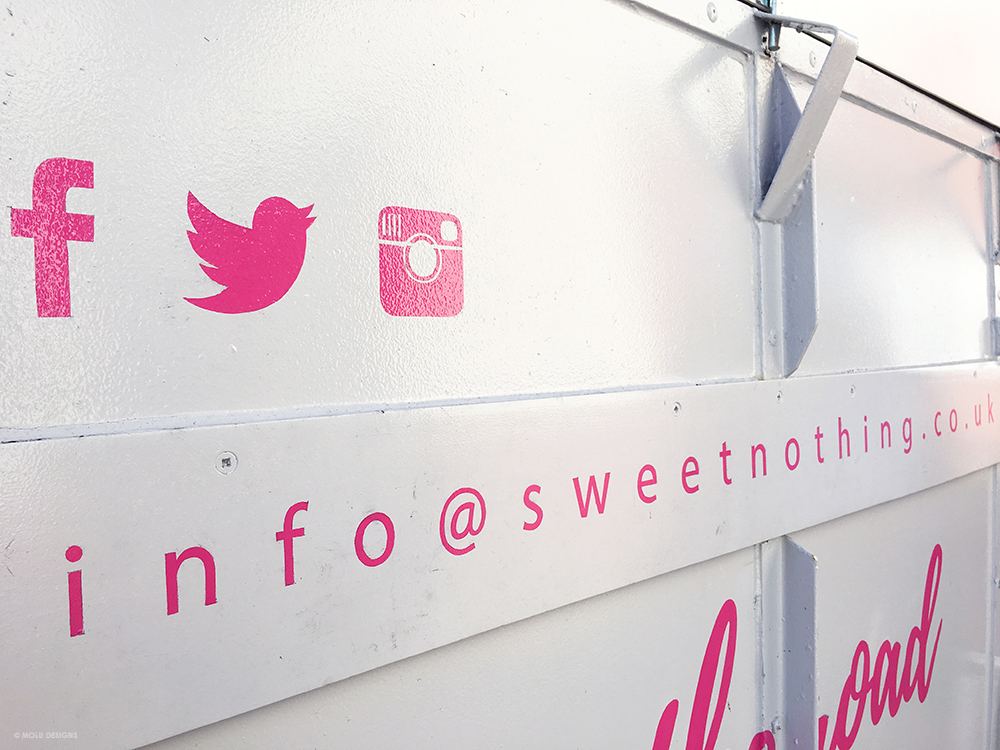
The lettering comprised of her business logo with some key strap lines and social media content, all in her brand colours. We wanted to keep the design pretty simple so that she had the flexibility to add further elements depending on the type of event and location she would be catering at.

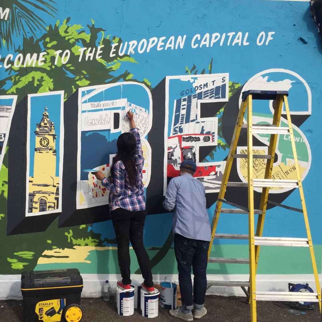
I've had so much fun working on this little beaut having always wanted to do food trucks and trailers! (and of course, having amazing clients that you work well with makes the whole thing even more enjoyable!)
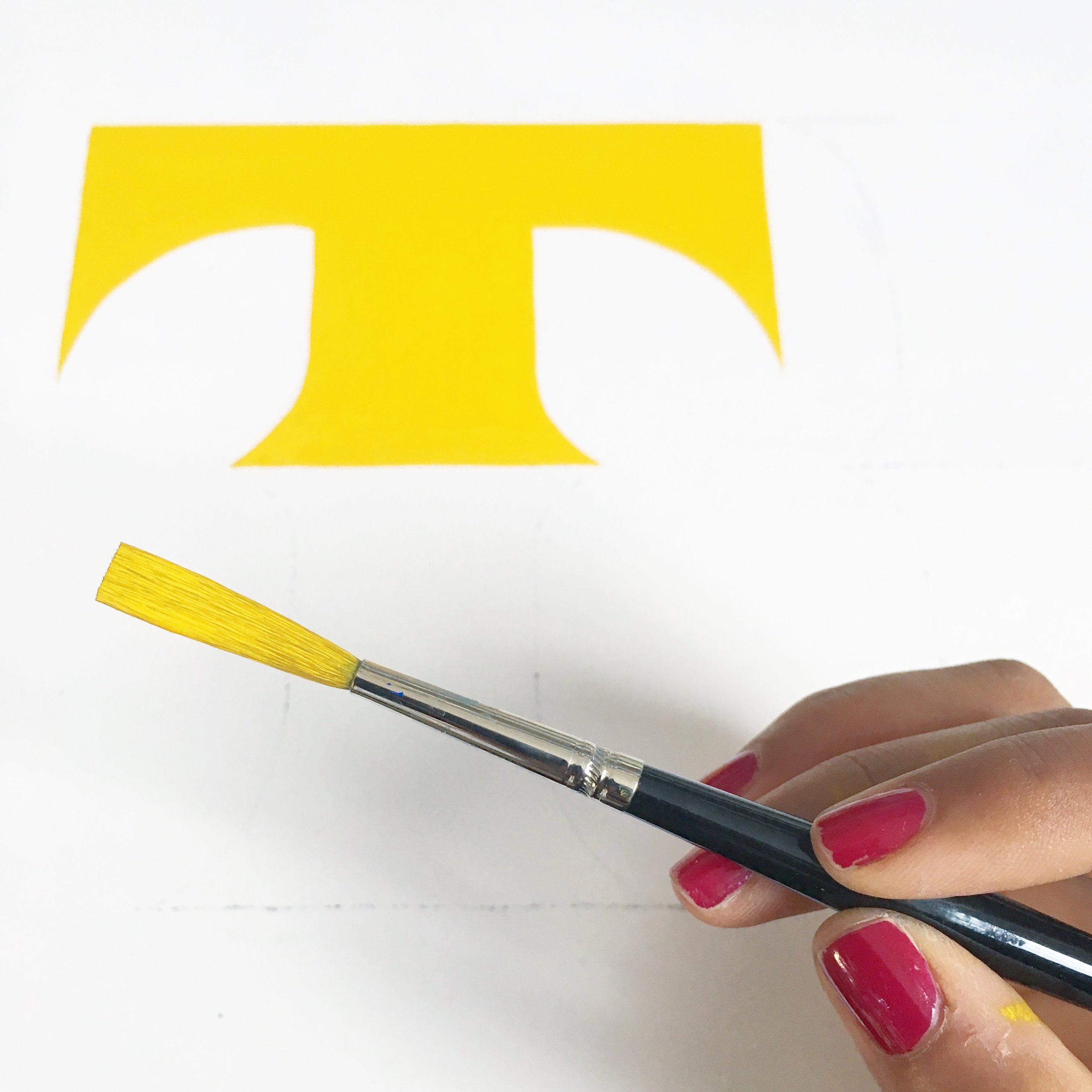
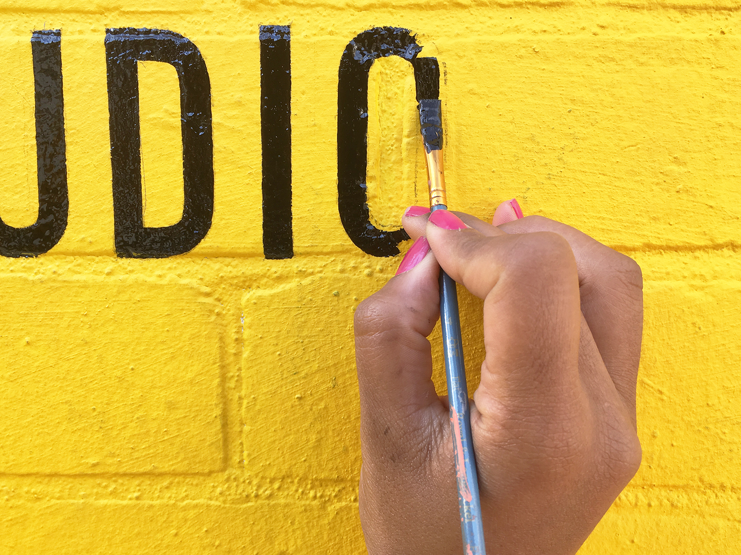
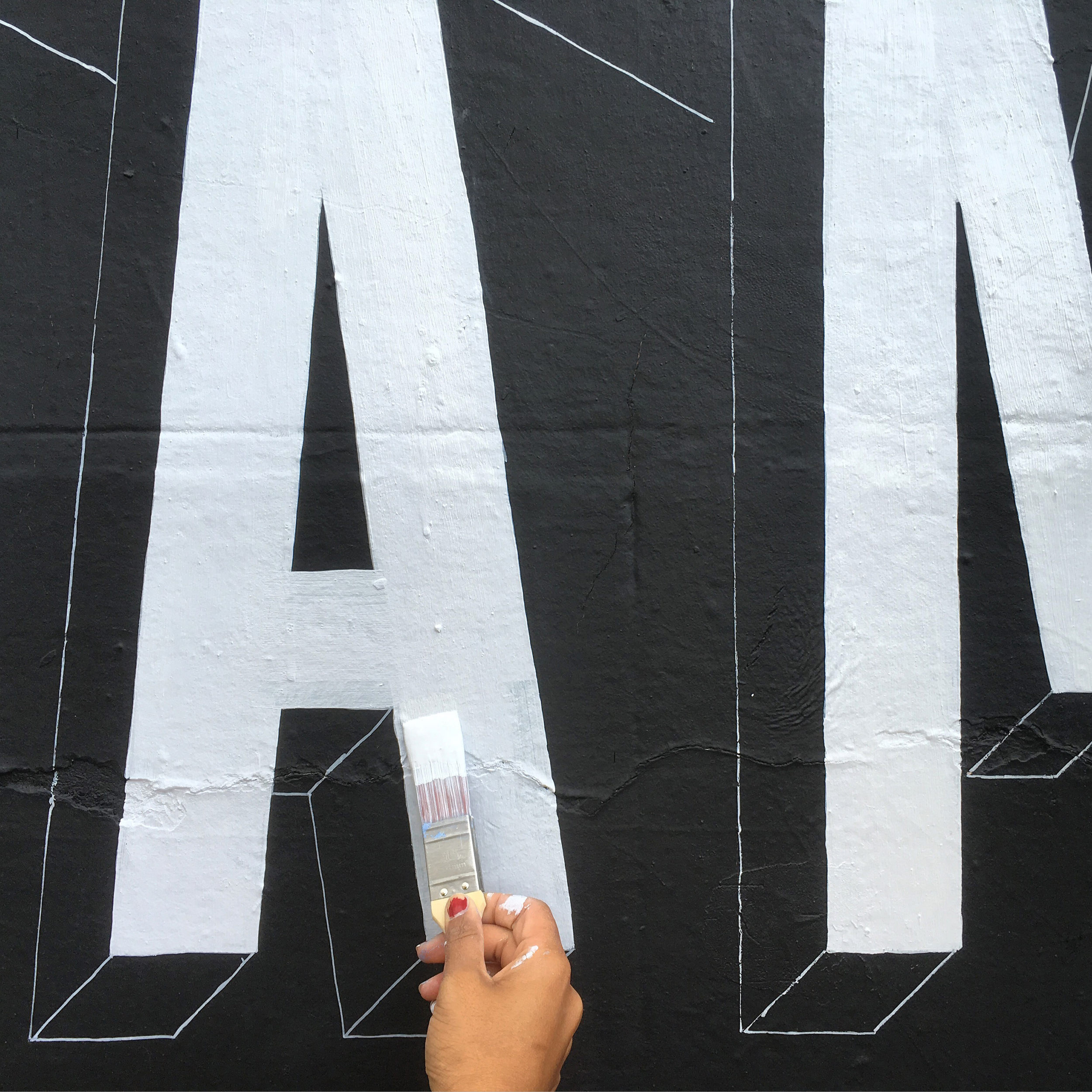
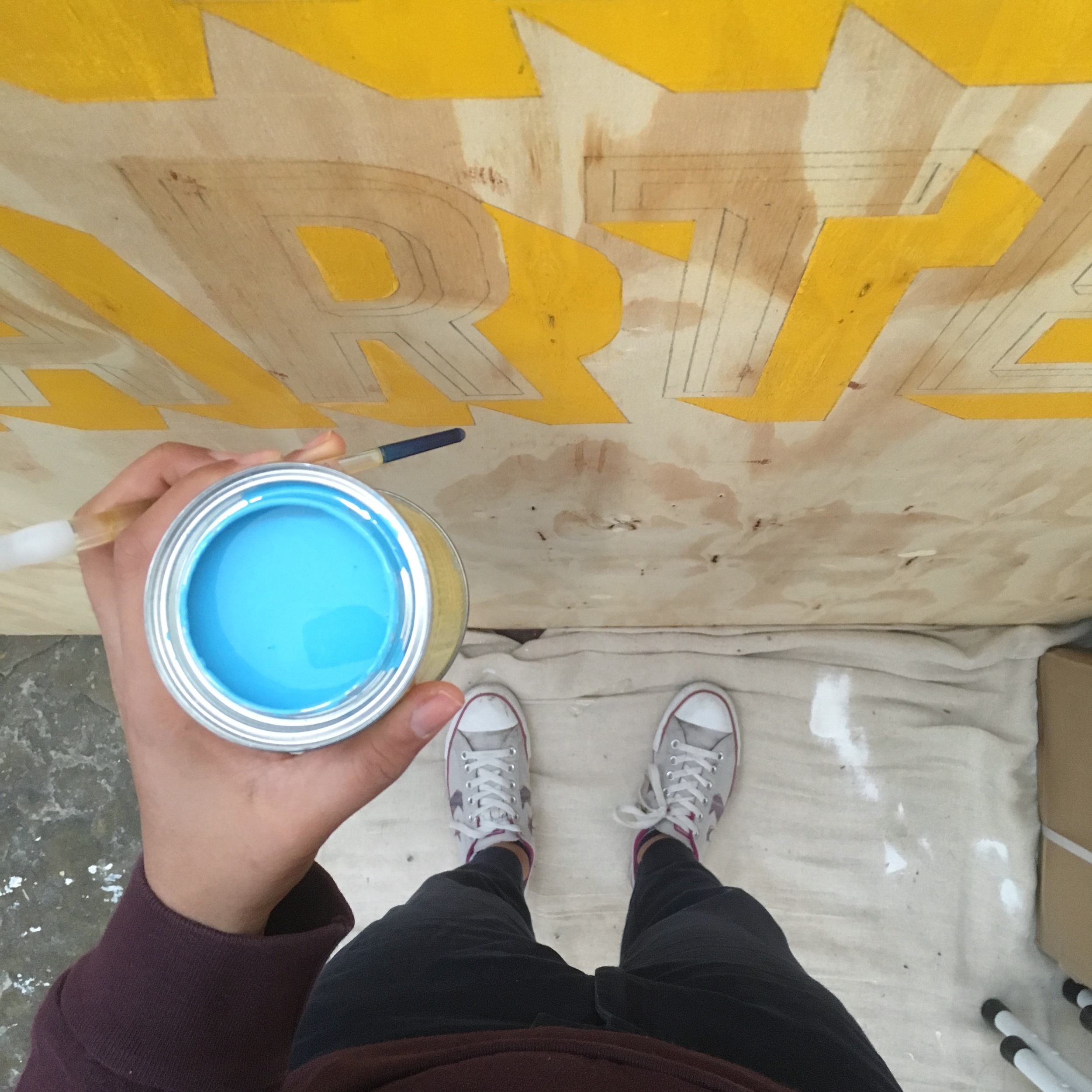
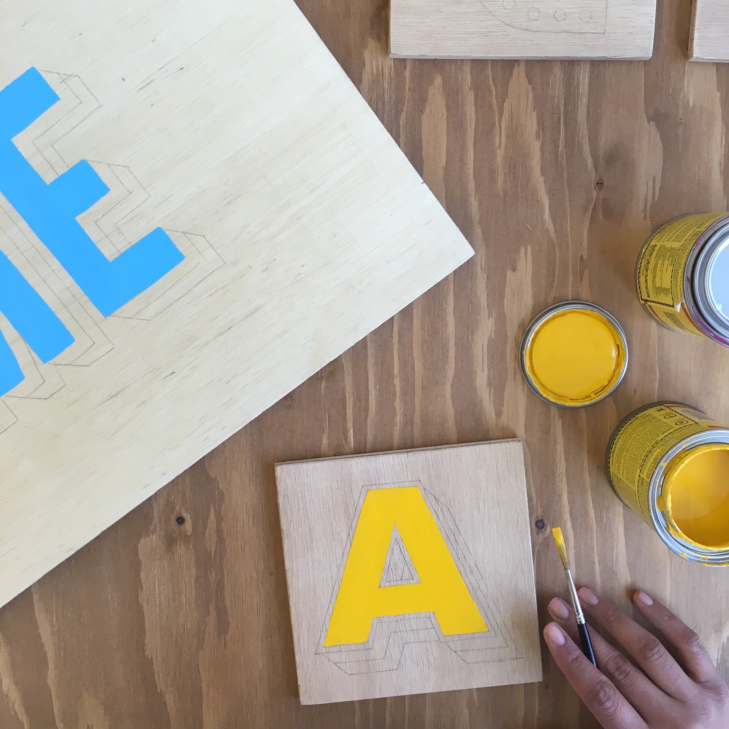
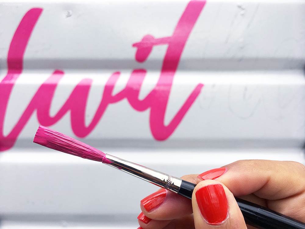
While the overall design wasn't anything too extravagant, the application work did consist of three days due to some tricky surface areas of the trailer and the size of some of the smaller lettering; one day setting up the lettering guides and drawing it all out, followed by two solid days of painting.
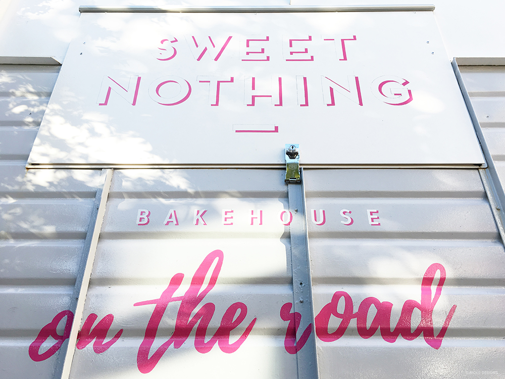
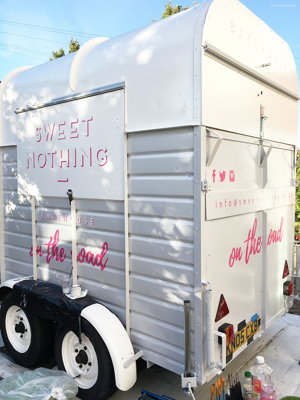
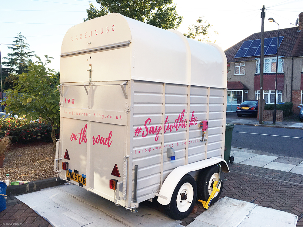
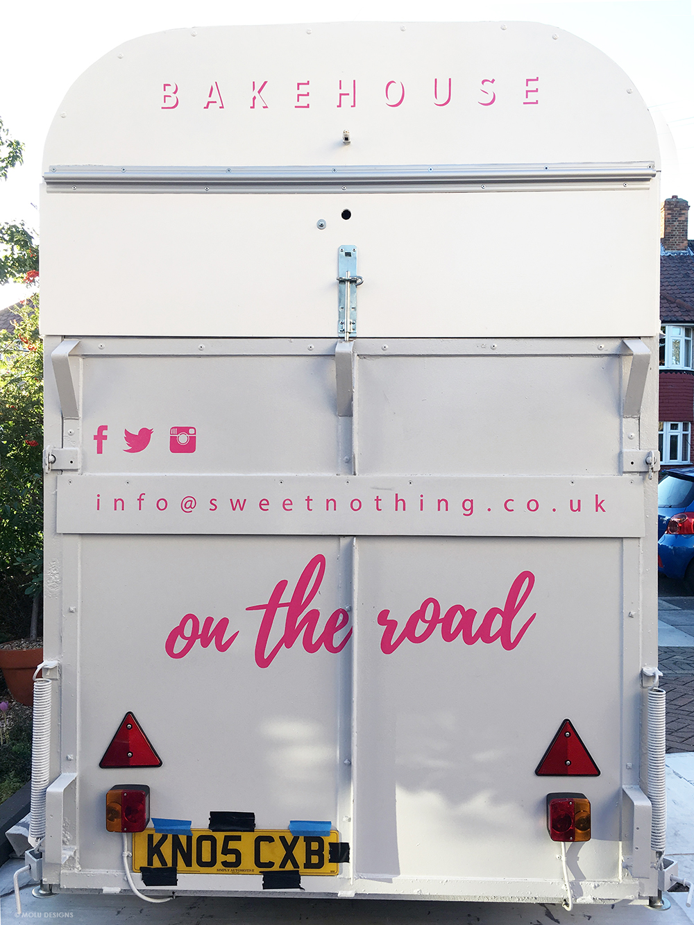
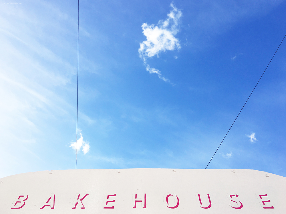
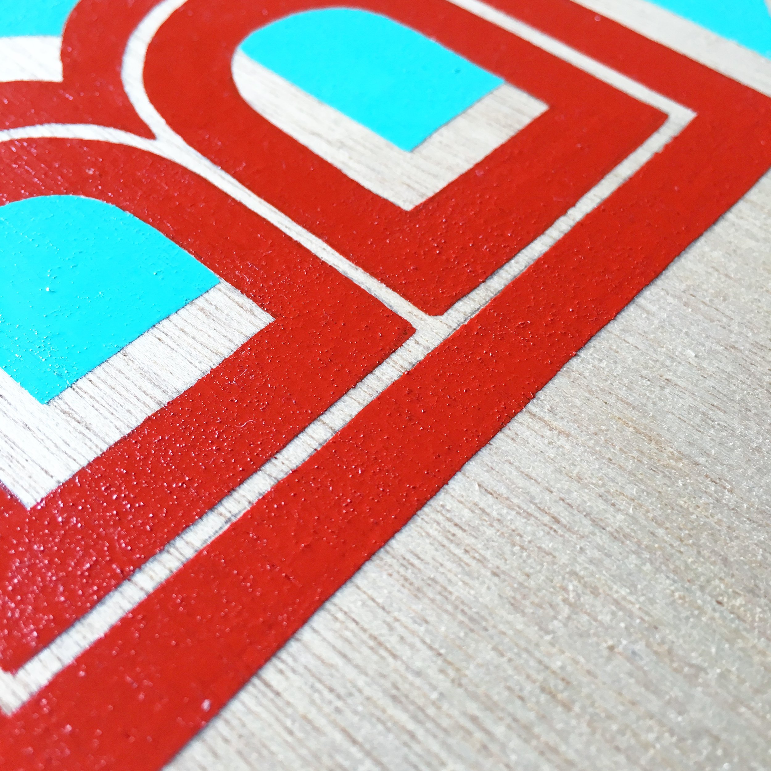
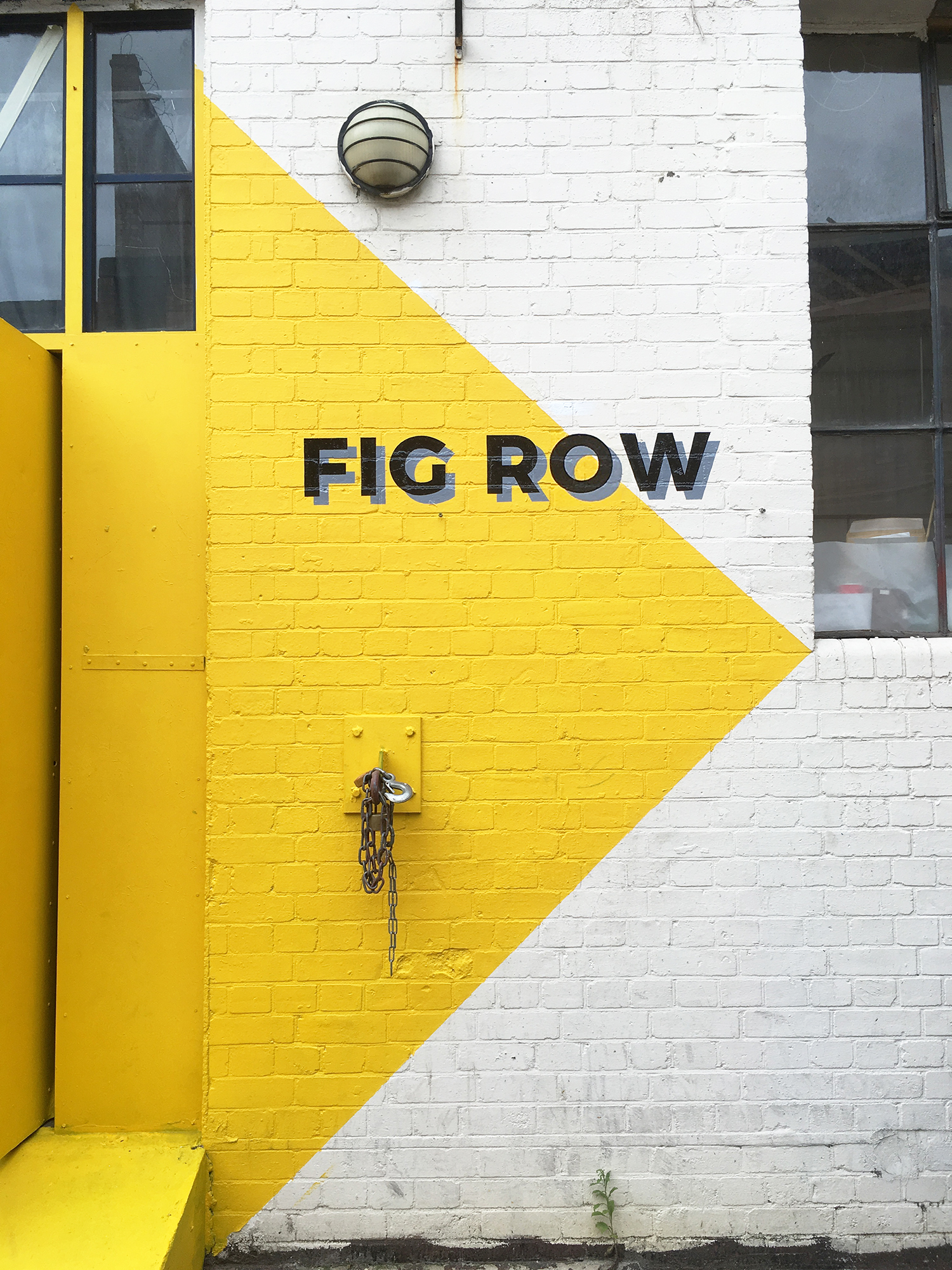
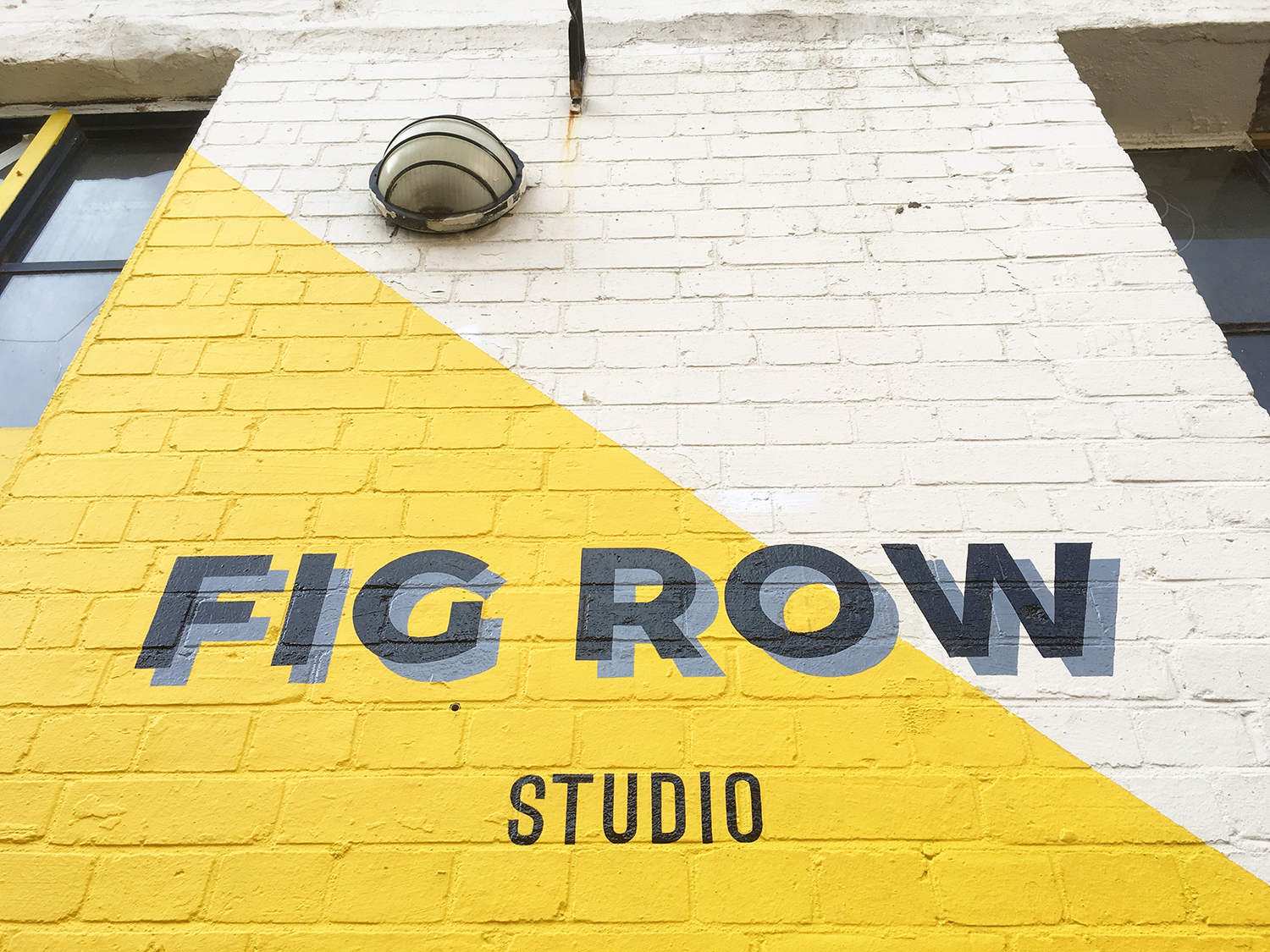
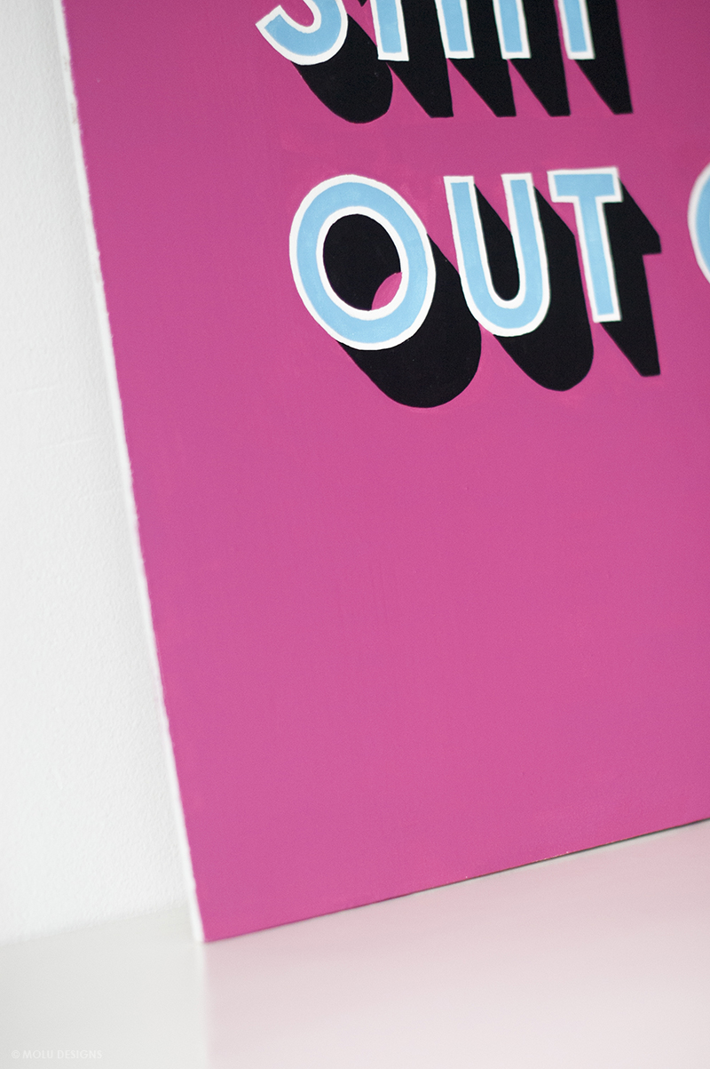
What do you think? I'm pretty pleased with how its all turned out. The colours all work really well and I just love the subtle yet clever use of drop shadow to give it that extra little pop without it being too in your face.
I'm hoping to get official photos of the trailer in-situ once it's on the road but I thought I'd share these with you in the interim. Phase two will consist of some larger and removable signage that would be used as props when stationery so i'll keep you posted when we come to that stage.
Well, If you, or anyone you know, are looking to get your trailers or food trucks painted - do give me a shout as I can't tell you how much fun these are to do! And i'm always full of ideas.... :)
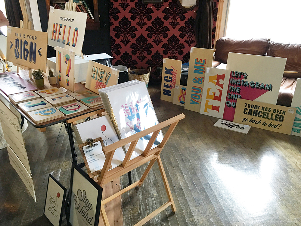
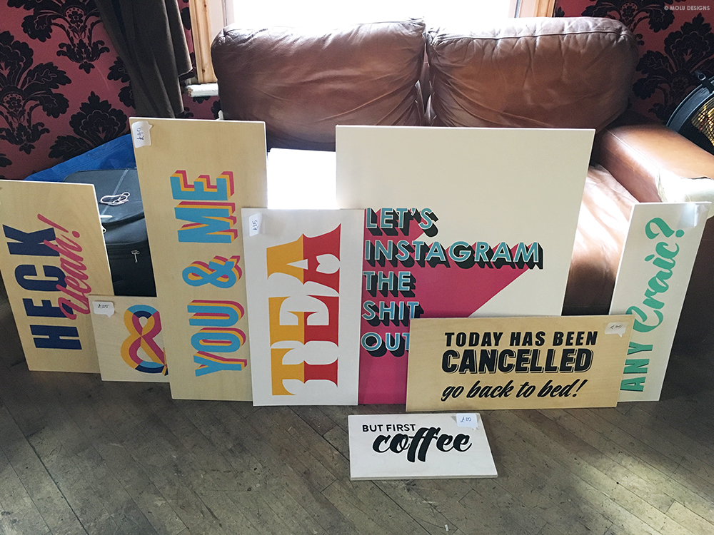
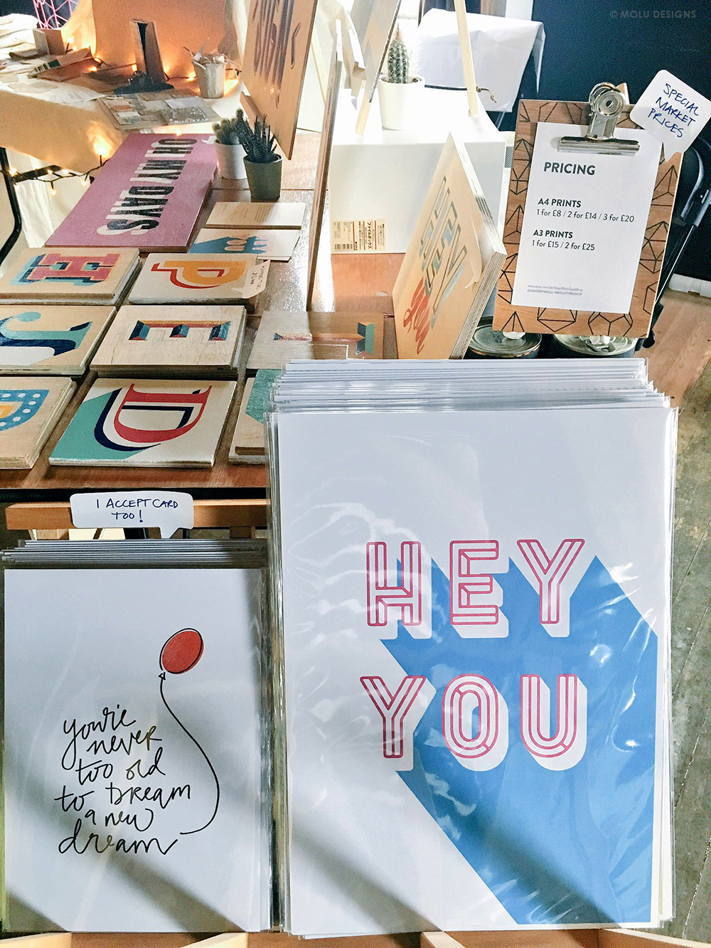
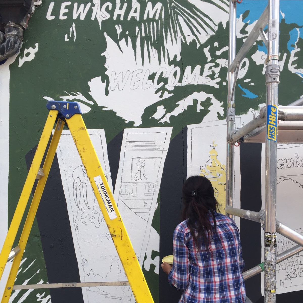
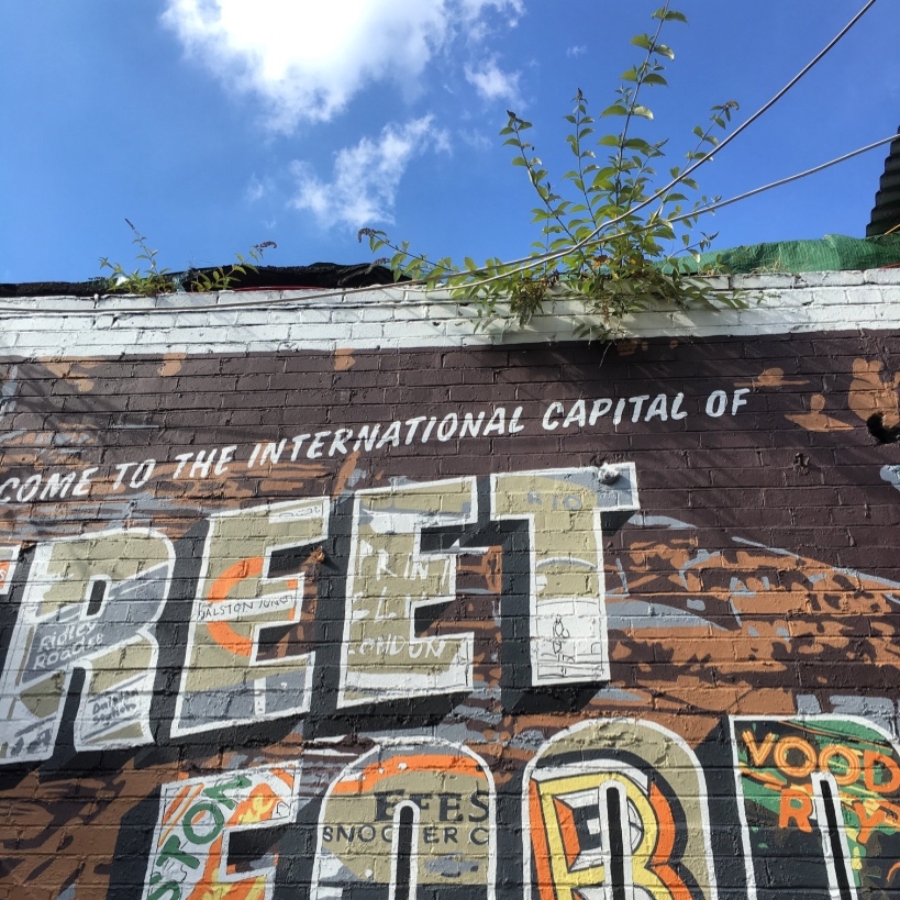
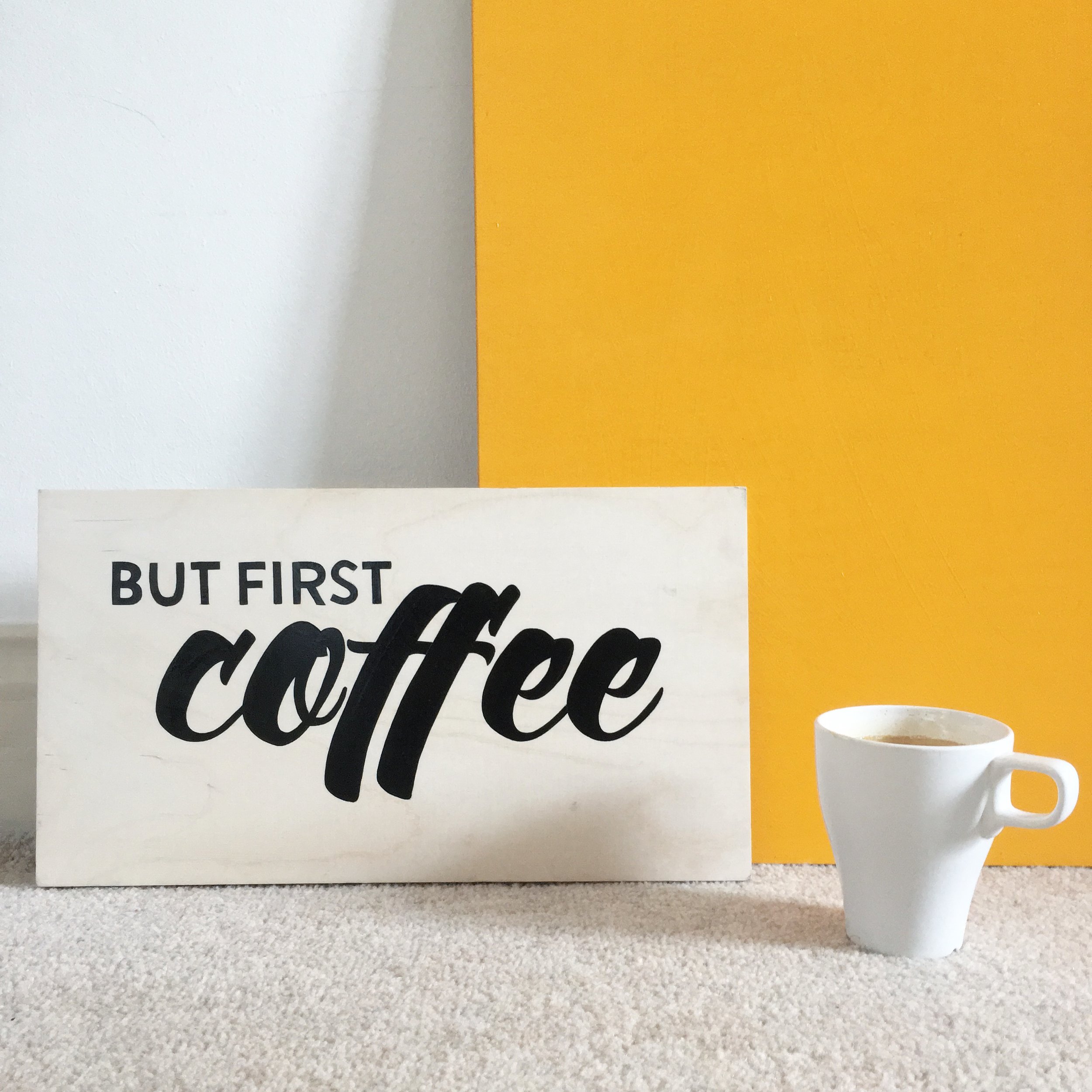
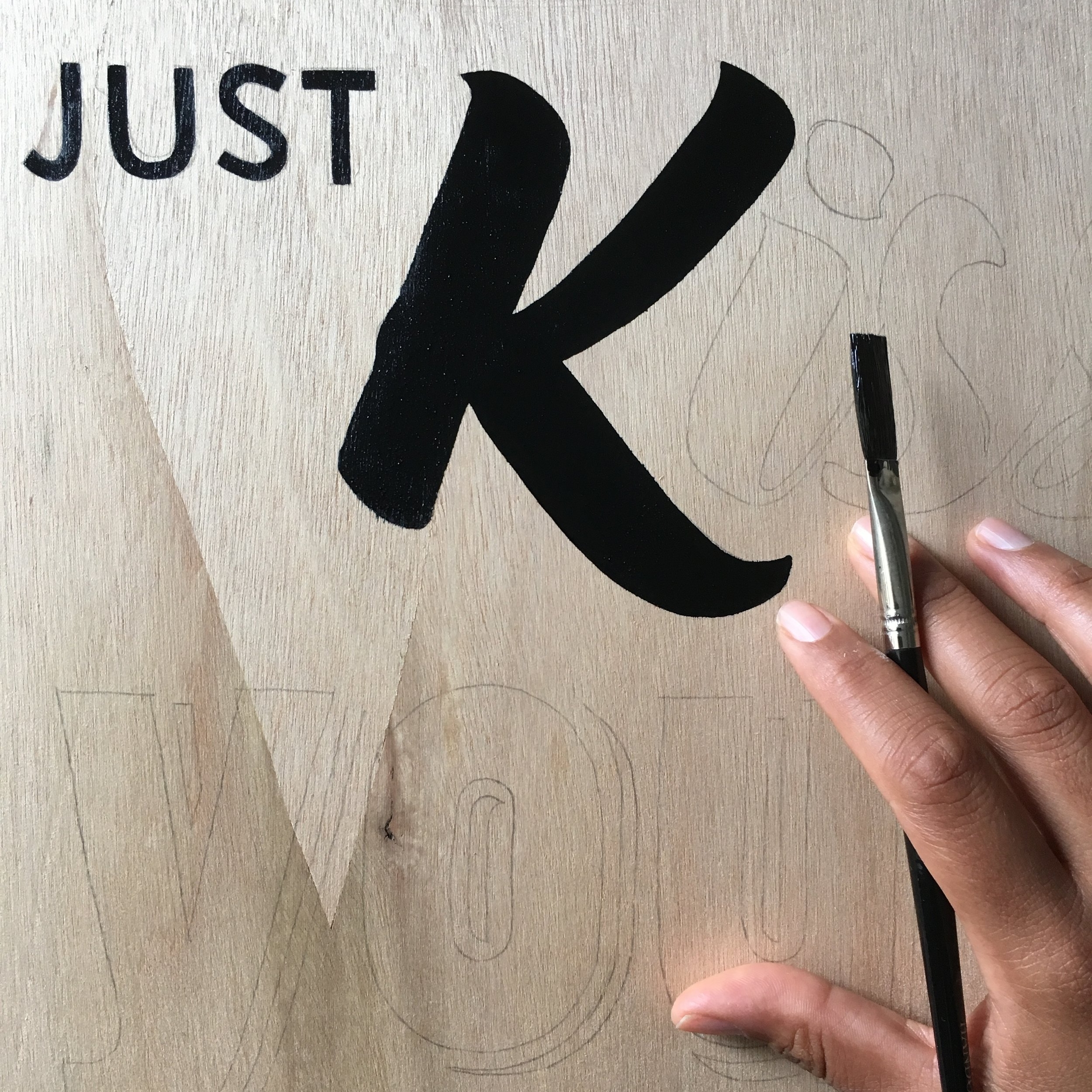
IMAGE CREDIT : Molu Designs
[All rights reserved ©MoluDesigns]